


Updated: April, 2026
Quick Summary
Marketing dashboards fail at an alarming rate, 40% of users rate their dashboards 3 out of 5 or lower, and 72% regularly export data to Excel when their dashboards don't deliver answers. Yet companies using effective dashboards make decisions 5 times faster than competitors and cut reporting time by 80%. This guide reveals 15 proven best practices that separate dashboards people actually use from those collecting digital dust.
The Marketing Dashboard Crisis: Why Most Fail
Here's an uncomfortable truth: 43% of SaaS professionals believe dashboards are dying. Not because data isn't valuable, but because most dashboards are built wrong from the start.
Walk into any marketing department, and you'll find the same pattern: a dashboard was built six months ago with great fanfare. Someone spent weeks configuring metrics, choosing colors, and adding widgets. Today? Nobody looks at it. The team still exports data to Excel, runs manual reports, and makes decisions based on gut feel.
The numbers tell the story:
- 40% of users say dashboards don't support decision-making
- 51% report dashboards lack meaningful interactivity
- 34% find dashboards too cluttered with irrelevant information
- 41% of teams spend over four months building dashboards that often miss the mark
But here's what's different about the 60% of dashboards that succeed: they follow specific, battle-tested best practices that prioritize clarity, speed, and actionability over visual flair.
Marketing Dashboard Problems vs. Solutions
Core Components of Effective Marketing Dashboards
Before diving into best practices, understand that every successful marketing dashboard is built on four fundamental elements. Gartner's research on dashboard design identifies these core components as essential for different dashboard use cases, whether you're tracking daily operations, planning strategy, or diagnosing performance issues.
1. Data Sources Your dashboard is only as good as the platforms feeding it data. Modern marketing teams typically pull from:
- Advertising platforms: Google Ads, Meta Ads, LinkedIn Ads, Microsoft Ads
- Analytics tools: Google Analytics 4, Adobe Analytics
- CRM systems: HubSpot, Salesforce
- Marketing automation: Marketo, Pardot, ActiveCampaign
- E-commerce platforms: Shopify, WooCommerce, Magento
2. Metrics Raw numbers like impressions, clicks, conversions, and revenue. These are the foundation but mean little without context.
3. Key Performance Indicators (KPIs) Metrics tied directly to business goals. For example, Customer Acquisition Cost (CAC) isn't just ad spend, it's ad spend divided by new customers, contextualized against your target.
4. Visualizations The charts, graphs, and tables that make patterns visible at a glance. The right visualization can reveal insights in seconds; the wrong one obscures them entirely.
15 Marketing Dashboard Best Practices That Actually Work
1. Define One Clear Purpose Per Dashboard
The Problem: You try to build one dashboard that serves executives, campaign managers, and analysts, and it serves none of them well.
The Solution: Create role-specific dashboards with laser focus:
- Executive dashboard: Revenue, ROI, marketing contribution to pipeline, CAC trends
- Campaign manager dashboard: Real-time spend pacing, CPL by channel, conversion rates, creative performance
- Analyst dashboard: Attribution models, cohort analysis, statistical significance testing
For teams working with Google Sheets or data warehouses, tools like Dataslayer can automatically consolidate marketing data from multiple sources into destination-specific dashboards, ensuring each stakeholder sees exactly what they need without manual data wrangling.
Real Example: A B2B SaaS company built separate dashboards for their CMO (monthly MRR impact from marketing), paid media manager (daily budget pacing and CPL), and content team (organic traffic, engagement metrics). Adoption jumped from 23% to 87% within two weeks.
Free Template
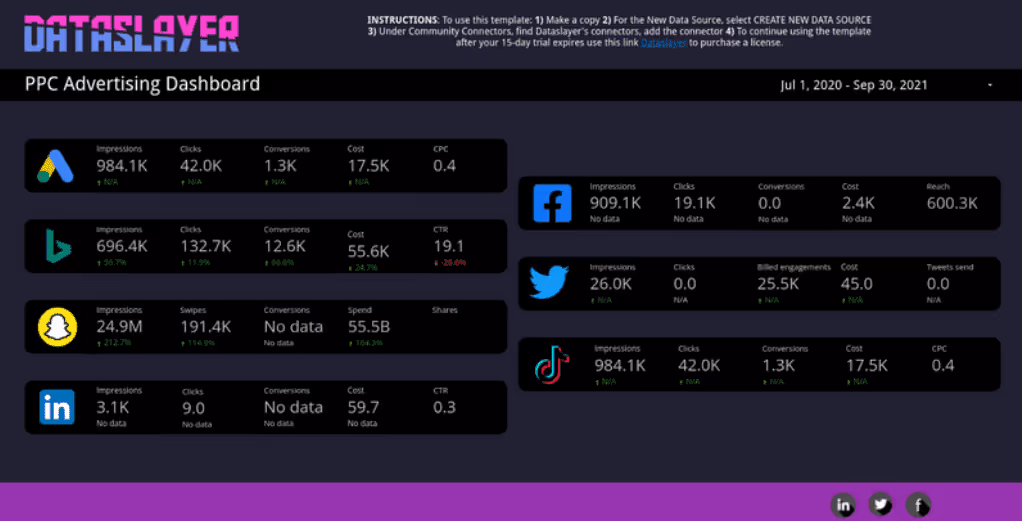
PPC Advertising Dashboard
Cross-channel paid media dashboard covering Google Ads, Meta, LinkedIn, TikTok and more — all in one view. Track spend, CPC, conversions and ROAS across platforms without switching tabs.
Get this template (free)2. Start With Business Questions, Not Metrics
The Wrong Approach: "Let's put cost per click, impressions, and conversion rate on the dashboard."
The Right Approach: "Which channels are generating qualified leads under $50 CPL? Is our LinkedIn spend trending efficiently this quarter?"
Build dashboards that answer specific questions:
- Are we on track to hit this quarter's pipeline goal?
- Which campaign creative is driving the lowest CAC?
- Where are we wasting budget on low-performing audiences?
- Is our email nurture sequence actually converting leads?
Actionable Tip: Before opening your dashboard tool, write down the 5 most important questions your team asks every week. Build metrics that answer those questions directly.
3. Follow the 5-Second Rule
If someone can't understand your dashboard's main message within 5 seconds, it's too complicated.
How to achieve this:
- Put the most critical KPI at the top left (where eyes naturally start)
- Use size and color to create hierarchy (biggest numbers = most important)
- Limit to 5-7 visualizations per dashboard page
- Add context with comparison periods: "This month vs. last month" or "Actual vs. Target"
Bad Example: A dashboard with 23 different metrics, all equally sized, no clear focal point.
Good Example: A dashboard with Cost Per Lead as the hero metric (large, top-center), supported by 4 supporting visualizations: CPL trend over time, CPL by channel, lead volume, and conversion rate.
4. Automate Data Updates, Never Show Stale Data
The Statistics: When dashboards consistently show outdated data, 67% of users lose confidence in their analytics entirely. Poor data quality isn't just a technical problem, Gartner research shows it costs organizations an average of $12.9 million per year through erroneous decisions, inefficiencies, and compliance risks.
The Standard: Marketing dashboards should update at minimum:
- Daily for performance monitoring (ad spend, conversions)
- Hourly for active campaign optimization (budget pacing, real-time bids)
- Real-time for crisis scenarios (website crashes, major budget overruns)
Critical Implementation: Always display data freshness timestamps. Users need to know if they're looking at data from 5 minutes ago or 5 hours ago.
Try Dataslayer's free trial to see how automated data pipelines eliminate manual exports and ensure your dashboards always show current data from Google Ads, Meta, LinkedIn, and 50+ other marketing platforms.
Free Template

Google Analytics 4 Dashboard
Pre-built GA4 dashboard with traffic sources, user behavior, conversions and engagement metrics — ready to connect to your property in one click.
Get this template (free)5. Design for Mobile First
The Reality: Marketing doesn't stop at 5 PM. Mobile traffic accounts for 57% of all internet usage, and marketing decisions increasingly happen outside the office.
Mobile-First Design Principles:
- Single-column layouts that don't require horizontal scrolling
- Large touch targets (buttons, filters) minimum 44x44 pixels
- Progressive disclosure: Show summary metrics first, allow drill-down to details
- Simplified visualizations: Line charts and bar charts work better than complex scatter plots on small screens
Real Scenario: A paid media manager receives a Slack alert about rising CPL. She pulls up the mobile dashboard while waiting for coffee, identifies that LinkedIn costs have spiked 40%, and immediately pauses three underperforming campaigns. Total time: 90 seconds.
6. Use Color Strategically, Not Decoratively
The Science: The human brain processes color before it processes text or numbers. Use this to your advantage.
Color Best Practices:
- Green = good, red = bad, yellow/orange = caution, stick to these universal conventions
- Limit to 6-8 colors maximum across the entire dashboard
- Use color to highlight exceptions, not to make every metric look "pretty"
- Test for colorblind accessibility (8% of males have color vision deficiency), W3C's Web Content Accessibility Guidelines (WCAG) recommend a minimum 3:1 contrast ratio for visual elements
Specific Example: In a conversion rate chart, use gray for all months except the current month (in blue) and any months that missed target (in red). This immediately draws attention to what matters.
7. Build Data Quality Checks Directly Into Dashboards
Here's a scenario every marketer has lived: You present campaign performance to leadership based on your dashboard. Mid-presentation, someone notices the conversion numbers seem off. You check the source, your Meta Ads connector broke five days ago. The room goes silent.
Prevention Through Built-In Validation:
- Data freshness indicators: Red alert if data is >24 hours old
- Anomaly detection: Automatic flags when metrics deviate >30% from normal ranges
- Completeness checks: Alert when expected data sources don't report
- Comparison validation: Cross-reference totals against platform APIs
Example Implementation: A dashboard that shows Google Ads spend should also display last updated timestamp, expected vs. actual row count, and a calculated field that flags any day with zero spend as "Possible Missing Data."
8. Implement Role-Based Access and Views
The Challenge: Your CMO needs a 30,000-foot view. Your junior coordinator needs campaign-level detail. Your finance team wants to verify budget spend. One dashboard can't serve all three effectively.
The Solution: Multi-Level Dashboard Architecture
Level 1—Executive View:
- 5-7 KPIs maximum
- Month/quarter trends
- Budget vs. actual
- Marketing's contribution to revenue
Level 2—Manager View:
- Channel performance breakdown
- Team member attributions
- Campaign efficiency metrics
- Week-over-week changes
Level 3—Specialist View:
- Granular campaign data
- Ad set and keyword performance
- A/B test results
- Technical debugging information
9. Make Every Chart Actionable
The Test: Look at each visualization and ask, "What specific action could someone take based on this chart?" If you can't answer immediately, remove it or redesign it.
Bad Visualization: A pie chart showing "Traffic by Source" with percentages.
Good Visualization: A bar chart showing "Cost Per Conversion by Source" with benchmarks, sorted from best to worst performance, with a clear annotation: "Shift $5K from LinkedIn (CPL $87) to Google Ads (CPL $42) to optimize Q4 budget."
Checklist for Actionable Visualizations:
- ✓ Does it show performance vs. goal or benchmark?
- ✓ Can the user drill down to investigate anomalies?
- ✓ Does it highlight what needs attention right now?
- ✓ Is there a clear "so what?" message?
Free Template
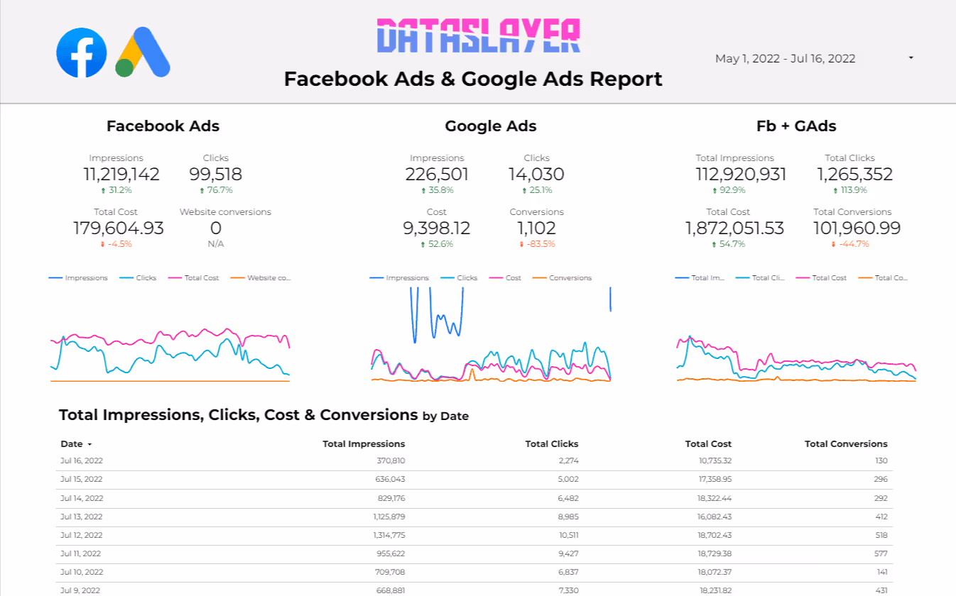
Facebook Ads & Google Ads Report
Compare Meta and Google Ads performance side by side — spend, CPC, CTR, conversions and ROAS in a single report. See where your budget works hardest.
Get this template (free)10. Use Consistent Naming Conventions Across All Platforms
The Hidden Time Drain: You're analyzing campaign performance, but Facebook calls it "Campaign Name," Google Ads calls it "Campaign," and LinkedIn calls it "Campaign Group." Suddenly, what should be a 5-minute task becomes 30 minutes of data cleanup.
The Solution: Enforce Taxonomy
Create and document a naming convention system, for example:
[Channel]_[Campaign Type]_[Audience]_[Start Date]
META_LEAD_C-SUITE_20260401
GADS_BRAND_AWARENESS_20260415
LNKD_WEBINAR_FINTECH_20260501Real Impact: A marketing agency managing 50 clients reduced dashboard build time from 6 hours to 45 minutes per client simply by standardizing campaign naming across all platforms.
11. Include Context With Every Metric
Numbers without context are just numbers. 53% of business leaders admit collected data goes unanalyzed because they can't interpret what the numbers mean.
Ways to Add Context:
- Period comparisons: "CAC is $67, up 12% from last month"
- Goal indicators: "85% to monthly lead target (need 45 more leads)"
- Benchmarks: "Conversion rate 3.2% (industry average: 2.8%)"
- Annotations: Mark significant events like product launches, competitor actions, seasonality
Example: Instead of showing "1,847 conversions," show:
- Current month: 1,847 conversions
- Last month: 1,623 conversions (+13.8%)
- Target: 2,000 conversions (92% of goal)
- Annotation: "Holiday campaign launched Oct 1st"
12. Optimize Dashboard Load Time
The Reality: 31% of teams struggle to offer dashboards that load fast. If your dashboard takes more than 3 seconds to load, users will abandon it.
Performance Optimization Tactics:
- Pre-aggregate data: Don't run calculations on raw data in the dashboard; process it beforehand
- Limit date ranges intelligently: Default to last 30 days, offer longer periods as opt-in
- Use incremental refresh: Only update new data, not entire historical datasets
- Optimize queries: Avoid SELECT * queries; request only necessary columns
- Implement caching: Store frequently accessed calculations
Technical Benchmark: A well-optimized marketing dashboard should load in under 2 seconds on a standard business internet connection.
13. Design for Scanning, Not Reading
Marketing professionals don't have time to read dashboards, they scan them. Design accordingly.
Scanning-Optimized Design Elements:
- Bold key numbers: Make the actual metrics 2-3x larger than labels
- Visual indicators: Use arrows (↑↓), color-coding, and icons
- White space: Don't fill every pixel; breathing room improves comprehension
- Clear labels: "Cost Per Lead" not "CPL" (avoid acronyms)
- Logical grouping: Related metrics close together, separated by subtle dividers
According to U.S. government data visualization standards, effective visualizations should limit the "big idea" to a central theme and use no more than two or three concepts to reduce cognitive load on the audience.
Heat Map Testing: Eye-tracking studies show users scan in an F-pattern (top, then left side, then center). Place your most critical metrics along this path.
14. Build in Collaboration Features
Marketing decisions aren't made in isolation. When sales, marketing, and leadership teams reference the same real-time metrics, strategy becomes more coordinated and decision-making improves.
Collaboration-Enabling Features:
- Annotation capabilities: Allow users to mark up charts with observations
- Scheduled distribution: Automatic email/Slack delivery of key dashboards
- Commenting threads: Enable discussion within the dashboard itself
- Shared views: Create custom views that can be bookmarked and shared via URL
- Version history: Track changes to dashboard configuration over time
Use Case: During weekly pipeline reviews, the team references a shared dashboard. The sales director adds an annotation: "Enterprise deals taking 2 weeks longer to close." Marketing adjusts their nurture sequence timing based on this real-time feedback.
15. Iterate Based on User Behavior
Your dashboard is never "done." The most effective dashboards evolve based on how people actually use them.
Metrics to Track:
- Dashboard views per user (low = poor adoption)
- Time spent per session (too low = not useful, too high = too complex)
- Most viewed visualizations (what really matters to users)
- Least viewed visualizations (candidates for removal)
- Export frequency (high exports = dashboard isn't answering questions)
Quarterly Review Process:
- Survey users: "What questions do you still need to answer elsewhere?"
- Analyze usage data: Which charts get ignored?
- Test improvements: A/B test dashboard layouts with small user groups
- Remove mercilessly: If a metric hasn't influenced a decision in 60 days, delete it
Common Marketing Dashboard Mistakes to Avoid
Mistake #1: The "Everything Dashboard"
Trying to show every possible metric creates cognitive overload. Focus beats comprehensiveness.
Mistake #2: Vanity Metrics Take Priority
Impressions and reach feel good but rarely drive business decisions. Prioritize conversion metrics, CAC, LTV, and revenue contribution.
Mistake #3: No Data Validation
40% of dashboard failures stem from poor data quality, not technology issues. Build validation into every data pipeline.
Mistake #4: Static Reporting That Never Changes
Business priorities shift. If your dashboard hasn't evolved in 6+ months, it's stale.
Mistake #5: Building Without User Input
The person using the dashboard should drive its design, not the person who knows the BI tool best.
Mistake #6: Ignoring the Dashboard Graveyard
According to research, unused dashboards form a "dashboard graveyard." Conduct quarterly audits, if a dashboard hasn't been viewed in 30 days, archive or rebuild it.
How to Build Your Marketing Dashboard: Step-by-Step
Phase 1: Discovery (Week 1)
- Interview stakeholders (30 minutes each): "What decisions do you make weekly? What questions do you ask repeatedly?"
- Audit current data sources: List all platforms, APIs, manual reports
- Document business logic: How is CAC calculated? What qualifies as a "qualified lead"?
- Identify gaps: Which questions can't be answered with current data?
Phase 2: Design (Week 1-2)
- Sketch wireframes on paper before touching the tool
- Prioritize ruthlessly: If you have 20 metrics, identify the 5 that matter most
- Define data refresh cadence: Real-time, hourly, daily?
- Choose visualization types: Bar charts for comparisons, line charts for trends, tables for details
Phase 3: Build (Week 2-3)
- Connect data sources using automation tools or APIs
- Create calculated fields: CAC, ROAS, conversion rates, etc.
- Apply design best practices: Color, layout, hierarchy
- Build quality checks: Data freshness, anomaly detection
Phase 4: Test & Iterate (Week 3-4)
- User testing sessions: Watch users interact with the dashboard
- Performance testing: Load times, mobile responsiveness
- Accuracy validation: Compare dashboard numbers against source platforms
- Collect feedback: What's missing? What's confusing?
Phase 5: Deploy & Monitor (Ongoing)
- Training sessions: Show users how to interpret and interact
- Usage monitoring: Track who's using it, what they're viewing
- Monthly reviews: Are business questions being answered?
- Quarterly redesigns: Evolve as business priorities change
If you want to eliminate manual data exports and dashboard maintenance, try Dataslayer free for 15 days and see how automated data integration consolidates all your marketing sources into Google Sheets, Looker Studio, BigQuery, or Power BI.
Build Your Marketing Dashboard in 5 Minutes with Dataslayer
The step-by-step process above is the right approach if you are starting from scratch. But if your main bottleneck is getting data from marketing platforms into your dashboard tool, you can skip weeks of manual setup.
Dataslayer connects 50+ marketing data sources (Google Ads, Meta, LinkedIn, TikTok, Google Analytics, Search Console, and more) directly to Looker Studio, Google Sheets, BigQuery, or Power BI. No code, no CSV exports, no copy-pasting between tabs.
Here is what the setup looks like:
Step 1: Install and connect. Add Dataslayer to your dashboard tool (Looker Studio connector or Google Sheets add-on). Authorize your ad accounts.
Step 2: Pick your metrics. Select the dimensions and metrics you need (campaigns, ad groups, keywords, dates) from a visual menu. No API documentation required.
Step 3: Set a refresh schedule. Choose how often your data updates: hourly, daily, or weekly. From that point on, your dashboard stays current automatically.
That is it. The 15 best practices in this guide still apply to how you design and organize your dashboard, Dataslayer just removes the data plumbing so you can focus on the design.
Frequently Asked Questions
What metrics should every marketing dashboard include?
The essential metrics depend on your role, but most marketing dashboards should include: Cost Per Lead (CPL), Customer Acquisition Cost (CAC), Return on Ad Spend (ROAS), Conversion Rate by Channel, and Marketing Qualified Leads (MQLs) vs. Target. For paid campaigns specifically, include: daily budget pacing, Cost Per Click (CPC), Click-Through Rate (CTR), and impression share. The key is connecting these metrics to business outcomes, don't just show clicks; show how clicks convert to revenue. Build separate views for different stakeholders: executives need revenue impact and ROI, while campaign managers need granular performance by channel, audience, and creative.
How often should marketing dashboards be updated?
The refresh frequency should match your decision-making cadence. Active paid campaigns require hourly updates for budget pacing and performance monitoring, you can't wait until tomorrow to discover you've burned through your daily budget by 10 AM. Standard performance dashboards should update daily, typically overnight when API data is most complete. Executive dashboards can update weekly or monthly since strategic decisions operate on longer timelines. Critical rule: never show data without a "last updated" timestamp. Users need to know if they're looking at data from 5 minutes ago or 5 hours ago. Automated data integration tools can sync data on custom schedules, ensuring you always have current information without manual exports.
What's the difference between a metric and a KPI?
A metric is any measurable data point: clicks, impressions, sessions, bounce rate, email opens. A KPI (Key Performance Indicator) is a metric directly tied to a strategic business goal. For example: "clicks" is a metric, but "Cost Per Click vs. $2.50 target" is a KPI because it's contextualized against a goal that matters to the business. Here's the test: can you take immediate action based on the number? "We had 45,000 impressions last month" doesn't tell you what to do. "Our Cost Per Lead increased 23% to $87, exceeding our $70 target" immediately suggests you need to optimize campaigns or adjust budgets. Effective dashboards minimize metrics and maximize KPIs, show numbers that drive decisions, not just numbers that exist.
How many marketing dashboards should our team have?
Most marketing teams need 3-5 dashboards, not 30. Follow this framework: 1 Executive Dashboard (CMO/leadership view: revenue impact, ROI, budget vs. actual, pipeline contribution), 1 Performance Dashboard (campaign managers: channel performance, CPL, conversion rates, spend pacing), 1 Content Dashboard (content team: organic traffic, engagement, lead generation from content), 1 Technical Dashboard (analysts: attribution models, data quality, testing results), and Optional Campaign-Specific Dashboards for major initiatives like product launches or events..
What tools should we use to build marketing dashboards?
The best tool depends on your technical resources, data stack, and reporting destinations. Popular options include: Google Looker Studio (free, great for teams already using Google Analytics and Google Ads), Microsoft Power BI (powerful, best for organizations already using Microsoft ecosystem), Tableau (enterprise-grade, exceptional for complex visualizations), Google Sheets (surprisingly effective for smaller teams, especially with automated data connectors), and Data warehouse + BI tool combinations like BigQuery + Looker for advanced use cases..
How do we get our team to actually use the dashboard?
Dashboard adoption is rarely a technical problem, it's a change management problem. Start by involving users in the design process: ask what questions they need answered, let them prioritize metrics, and show them prototypes for feedback before building. Make the dashboard dramatically easier than current workflows: if pulling a report from your dashboard takes longer than manually checking three platforms, people won't switch. Embed dashboards into existing workflows: add them to Monday morning team meetings, share automatic Slack updates, or make them the first agenda item in 1-on-1s. Celebrate data-driven wins: when someone makes a good decision based on dashboard insights, recognize it publicly. Ruthlessly remove unused metrics: cluttered dashboards that require scrolling or thinking get abandoned. Finally, monitor usage analytics: if specific team members aren't engaging, schedule 15-minute training sessions to understand their blockers. Remember: 40% of users rate dashboards 3/5 or lower, if yours isn't being used, it's almost certainly a design problem, not a user problem.
What's the ROI of building effective marketing dashboards?
The ROI of effective dashboards is measured in time saved and better decisions made. Quantifiable benefits include: 80% reduction in reporting time (what took 10 hours per week now takes 2 hours with automation), 5x faster decision-making (data-driven companies make decisions five times faster than competitors), 12-15% improvement in marketing efficiency (by reallocating budget from underperforming to high-performing channels faster), and reduced agency/consultant costs (internal teams can answer questions without external help).
Conclusion: From Data to Decisions
The gap between companies drowning in marketing data and those thriving with marketing insights comes down to dashboard design. 40% of dashboards fail not because of bad data or wrong tools, but because they prioritize aesthetics over answers, comprehensiveness over clarity, and features over focus.
The 15 best practices in this guide share a common thread: build dashboards that drive action, not just display information. Start with business questions, ruthlessly prioritize what matters, automate data updates, and iterate based on actual usage.
Your dashboard's success isn't measured by how impressive it looks in a design portfolio. It's measured by whether a campaign manager can make a budget decision in 30 seconds, whether an executive can confidently present marketing ROI to the board, and whether your team stops exporting data to Excel.
The best time to rebuild your marketing dashboard was six months ago. The second-best time is today.
If you are ready to eliminate manual reporting and build dashboards people actually use, try Dataslayer free for 15 days. Automatically consolidate data from Google Ads, Meta, LinkedIn, Google Analytics, and 50+ marketing platforms into Google Sheets, Looker Studio, BigQuery, or Power BI. Get data quality validation, consistent formatting, and zero maintenance. Start your free trial at dataslayer.ai


