

For your business to grow, you must try to see and compare the evolution of your marketing or advertising campaigns over time in Looker Studio. This is because comparing your marketing performance over time allows you to spot areas for improvement, as you find more tactics to optimize your future campaigns.
Measuring your marketing campaign effectiveness at the campaign level is crucial to identify the primary factors that impact your strategy, like a surging cost per lead or a sudden drop in traffic. However, understanding how your campaigns compare over time helps you spot deeper insights and valuable trends that can maximize the impact of your campaigns.
And that’s why, today, we’re going to dive deep into how you can see and compare the evolution of your marketing campaigns during the year in Looker Studio (Google Data Studio). We will discuss the custom formulas to join several data sources through blending and comparing using the date ranges feature.
So, let’s dive in!
How to import, view, and compare all your marketing campaigns’ data in Looker Studio
To compare your marketing campaigns’ evolution during the year, or periodically in Looker Studio, there are two options: to blend your data and compare or use a comparison data range. So, we will dive into how to import your data, blend them, and then, compare them in Looker Studio.
How to import your marketing data and create reports in Looker Studio
To build a new comparison report, you must first collect your data from your marketing platforms. Looker Studio provides connectors to numerous data sources, and there are also a couple of community data sources to help you get all your data into the platform.
So, here’s the process to import your data from your marketing sources:
- Sign in to Looker Studio.
- Click Create in the top-left corner of the Looker Dashboard, then Data source.

- Next, choose your preferred marketing data source and authorize Looker Studio to source the data from there. Then, click Connect to use it in your reports.
- Once you authorize and connect it, you can tweak the parameters as you see fit for your needs. Here is an example of connecting Looker Studio to LinkedIn Ads data through the Dataslayer LinkedIn Ads connector.
- Next, create a new report to visualize your data. And to do so, click Blank Report or Create then Report at the top left of your dashboard.
- Next, click Add Data and connect to new data sources if you haven’t added them yet, or tap on My Data Sources to use your previously connected data sources.

Note:
- The process for connecting to your data sources is similar for all our connectors, as well as many others in Looker studio. So, follow this process to bring all your other data to Looker Studio.
- You can do this for all your other data sources to use in your report.
How to visualize the comparisons of your data in Looker Studio
There are different ways to visualize your data in Looker Studio. In this example, we will explore how you can use tables with heat maps to view your data periodically in Looker Studio. Once you’ve added all your data sources to your report, as we did in the last steps, it is now time to visualize and do simple comparisons on your data. So, let’s dive in.
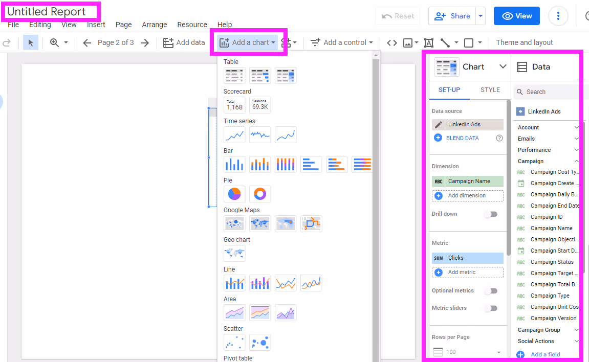
- To add a chart to visualize your data in Looker Studio, go to Add Chart. Then, pick a chart to visualize your data. Here, we picked the Table with heatmap from the add chart dropdown, which automatically used the Campaign Name as a dimension and Clicks as a metric from our data source.
Note: You can choose any chart to meet your data comparison needs.
- However, for simplicity, we will need to compare the data based on the date. So, we will remove the campaign name as a dimension and add Year-Month from our data set. Different data sources use different formats for the dates. And depending on your needs, you must configure them to make the values the same for all our data sources.
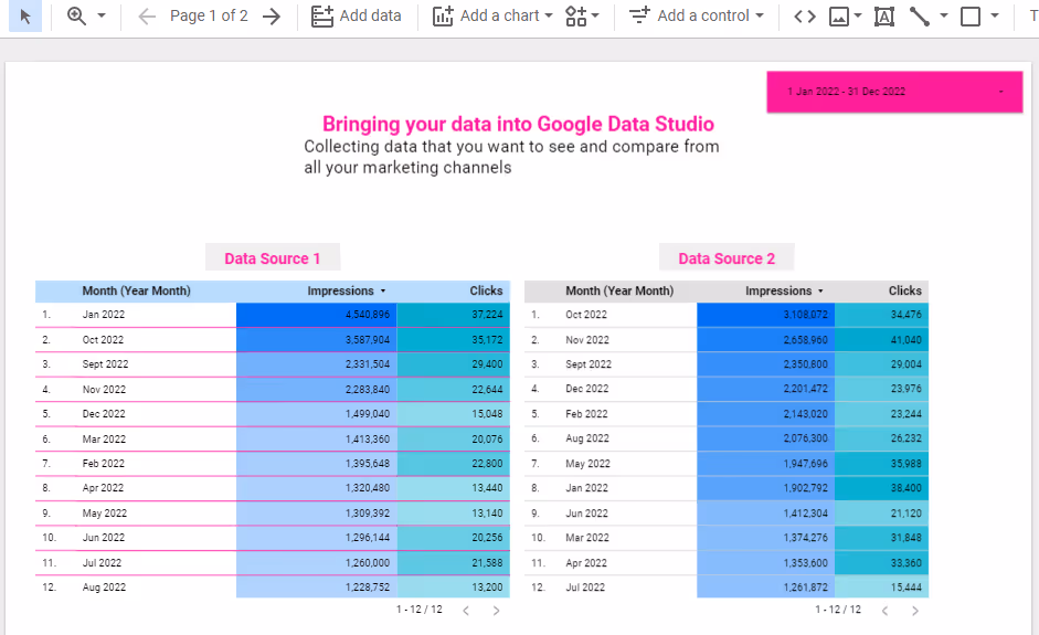
- Here’s an example of two data sources that we’ve brought to our report. We created two tables with heat maps to represent our data from each data source. These tables represent monthly impressions and clicks for the two different marketing campaigns.
How to blend and compare data from different sources in Looker Studio
If you have several marketing campaigns from different channels, bringing them all to your report is not enough for you to compare efficiently the evolution of your marketing campaigns. How do you find a way to combine all these data into a single chart that tells your overall performance quickly and accurately?
That’s exactly where data blending comes to your aid. For example, what if you want to see the total ad impressions and clicks across all your marketing channels to calculate your overall monthly conversion rates? There are several ways to create a blended data source in Looker Studio, and here’s the simplest way to do it:
- From the charts that we created above, select all of them, right-click, and click Blend data at the bottom of the context menu.
- Instantly, Looker Studio will create a new chart based on your data sources. If you do not have complex dimensions and metrics on your charts, you may get a clean chart that does not require more configuration.
- However, if the resulting chart needs some tweaks, check out the data column and use the right dimensions and metrics from your blended data source. You can use this data to create other custom charts, like creating new fields to calculate totals, Click-Through-Rates, and more.

Read more: Previously, we wrote an article about the limitations of Data Blending in Looker Studio, and how to overcome them. So, be sure to check that article.
How to compare your marketing campaigns’ data using the date comparison feature
Say you want to compare data from your marketing campaigns for last week with those of the previous week before that. Or maybe you want to compare data for May last year with those of May the previous year. How can you do so?
To build reports that show the reader how performance for a certain period compares to another, use the Compare option in the date range selector. You can use tables or scorecards and color-coded arrows to show the direction of the changes (delta).
To create such reports, here’s how to do it:
- From your report, choose the chart that you want to compare, and click the down arrow on the date range control button at the upper corner of your report workspace. If you can’t find a date control in your report, add one from the controls in the menu.
- Next, click the toggle compare in the dropdown, and select a comparison period. This period can be the default, the previous year, or a custom date range.
- Once you select the date range you want to compare, click Apply. When you hit Apply, your chart will update to include data from your selected date range. You can click on the double arrows on your chart to expand your comparison to include complete comparison metrics on your chart.
And there you have it. Clean comparison of your marketing data!
How to segment your data by time
If your data source provides just the date and time for your dimensions, you must configure this date to help you get a granular view of your data. To segment your data according to dates, e.g., daily, weekly, monthly, quarterly, etc., with Looker Studio, it is much more possible.
To do so, you have to edit your data source’s date format to match your preferences. So, click on your chart, then on the properties, and click the edit button on your dimension with a date dimension. In the sub menu that comes up, change the data type to your desired periods.
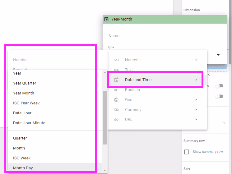
For example, if you broke down your data using the year, you can change the date type to Year month to segment your data into monthly data. Thus, instead of getting an overall yearly comparison, you will get comparisons for each month from the years. And so, instead of one row for the year, you will now have 12 rows for each month for your selected year.
Best practices and tips for creating effective marketing comparison dashboards in Looker Studio
To create the best reports that communicate the right message to your team and stakeholders, you must follow the following five best practices and tips to create effective dashboards for your marketing campaigns.
Include titles, subheads, and context
Adding charts to Looker Studio is not the only task that you can do to create the best reports for your data. Also, you should include the relevant info about your charts before you select your data sources, dimensions, metrics, and date ranges to populate your visualization.
That way, you make it easier for users to know what your chart is all about. So, add titles to your comparison data visualizations. Additionally, add subheadings, legends, and microcopy to provide additional context to your reports. Also, include information that is not included in your charts, such as the data sources used, the date ranges, etc.
Use KPI scorecards on your reports
Essential Key Performance Indicators (KPIs) that you must track in your marketing campaigns are the most valuable features that you must include in your dashboards. You should include them in prominent areas of your reports to show that these metrics are of higher priority.
KPIs include all the growth metrics that you can use in your dashboards to tell your marketing evolution over time, like Click-through-Rates (CTR), Return on Ad Spend (ROAS), Lead Volume, etc. To add a KPI scorecard in Looker studio, go to Chart then Scorecard.
In the metrics section of the Setup Panel, choose a KPI and repeat the process as needed. Finally, go to Style Panel and customize the size and format of your scorecard.
Compare your goals to your achievements
Having goals for all your marketing campaigns can help you drive your efforts efficiently. However, pacing your previous goals against the results is one way to spot if there is a need for improvement.
Whether your stakeholders are asking to know if you are hitting on your marketing goals or not, you must clearly show it on your dashboards. While goals and objectives for most of your marketing campaigns aren’t standardized, pacing options are also not. So, to use a pacing chart in Looker, you must use a chart with pacing such as a bullet or gauge, then add a calculated field with progress to the goal.
Bring all your marketing data to Looker Studio with Dataslayer and compare them efficiently
To conclude, comparing all your marketing data in Looker Studio lets your readers know if things are improving, or need improvement, over time. That is, creating dashboards that tell the story of how your marketing data has been performing over time is one of the most important functions of data visualization.
And so, to do that, you must collect and compare your marketing data in a data visualization tool, like Looker Studio. You can use Dataslayer connectors for Looker Studio to import your favorite marketing data for comparison and visualization in Looker. Dataslayer has over 40 different data sources to help you bring your data efficiently. And when you can bring all your data to Google Data Studio, it becomes easier to see the trends and historical comparisons of your marketing campaigns across your digital marketing channels.


