
.avif)
If you've spent any time picking a data visualization tool for your marketing team, you've noticed the same problem: every "best of" list reads like a feature checklist with no mention of how data actually gets into the tool. Tableau is brilliant, but if you spend three weeks building an ETL pipeline to feed it Meta Ads spend, the brilliance compounds late. Power BI is beautiful, but only if your team writes M queries fluently. Looker Studio is free, but the data source library decides what you can ever report on.
This guide takes a different angle. We rank 18 data visualization tools by what they connect to natively for marketing data. That is the layer most listicles skip. Whether you're a 2-person agency picking your first BI tool or an enterprise team replacing Tableau, the integration story is the constraint that decides whether you ship dashboards in a week or a quarter. Tool features matter; integration determines whether the features ever see your data.
For context on the surrounding marketing reporting stack, see our deeper framework in the marketing dashboard KPIs playbook. This post sits one layer up: the visualization tools themselves, evaluated for marketing-team realities.
How we evaluated the 18 tools
Four criteria, all weighted equally:
- Native marketing data integrations. Does the tool ship with native connectors to Google Ads, Meta Ads, LinkedIn Ads, TikTok Ads, GA4, Search Console, and similar? Or does every source require ETL middleware first?
- Time to first dashboard. From signup to a working dashboard with real marketing data: hours, days, or weeks?
- Pricing transparency. Public pricing visible on the site, or "contact sales" black box?
- Marketing-team fit. Designed for analysts who code, marketers who don't, or hybrid roles? Realistic learning curve for the typical user.
We do not weight chart aesthetics or scientific viz capabilities. If you need niche statistical plots or scientific publishing, this is not your shortlist (look at ggplot, D3, or Observable instead).
Enterprise BI platforms (6 tools)
Heavy-duty platforms with deep modeling, governance, and analyst tooling. Higher cost, more setup time, much higher ceiling for analytics maturity.
1. Tableau
The category-defining enterprise BI tool, now owned by Salesforce. Deep visual analytics, strong governance, sprawling community. Tableau's chart library and analytical depth still set the ceiling for what's possible in a no-code-by-default tool.
Best for: Mid-to-large analytics teams with at least one dedicated Tableau developer. Organizations already invested in Salesforce or with a strong data engineering function feeding Tableau a clean warehouse.
Marketing integration reality: Tableau has no native marketing source connectors. Google Ads, Meta Ads, LinkedIn Ads, TikTok all require an external data integration layer loading into Snowflake, BigQuery, Redshift, or a flat file. The Tableau Web Data Connector framework allows custom integrations but requires development effort.
Pricing: Tableau pricing for Tableau Creator on Tableau Cloud is $75/user/month with annual billing. Viewer and Explorer roles available at lower tiers. Server and Cloud deployments add infrastructure costs.
Pros: Industry-leading visual flexibility, mature community, robust governance.
Cons: Steep learning curve, no native marketing connectors, expensive at scale.
2. Microsoft Power BI
Microsoft's dominant BI tool. Heavily entrenched in any organization already on Office 365, with native Microsoft Fabric integration as of 2024-2025. The Power Query layer makes it powerful for analysts willing to write M.
Best for: Microsoft-shop organizations, finance and operations teams that already live in Excel, B2B companies whose data lives in Dynamics or other Microsoft systems.
Marketing integration reality: Power BI ships with a handful of native marketing connectors (Google Analytics is built-in; Adobe Analytics is included; Salesforce is native). For Google Ads, Meta Ads, LinkedIn Ads, TikTok, and most paid media sources, you need either Power Query custom development, a third-party data connector, or an ETL layer landing data into a warehouse.
Pricing: Power BI pricing: Pro is $14/user/month, Premium Per User is $24/user/month total. Premium capacity (organization-wide, now delivered through Microsoft Fabric) starts at roughly $5,000/month for the smallest SKU that includes Power BI and scales up.
Pros: Best price-to-power ratio at scale, deep Microsoft ecosystem integration, strong DAX engine.
Cons: Mac users locked out of native desktop authoring; native marketing connectors are limited; M and DAX have steep learning curves.
3. Looker (Google Cloud)
Distinct from Looker Studio (the free one). Looker is Google Cloud's enterprise BI platform built on LookML, a semantic modeling language. Centralized metric definitions, strong governance, embedded analytics.
Best for: Data-mature organizations that want a single semantic layer feeding multiple consumption tools. Teams with at least one LookML developer.
Marketing integration reality: Looker connects to data warehouses (BigQuery, Snowflake, Redshift, Databricks, etc.). Marketing data needs to land in the warehouse first via an ETL layer. The Marketing Analytics by Google solution is built on top of BigQuery and Looker, but you still need to pipe non-Google sources in.
Pricing: Custom enterprise pricing, no public self-serve tier. Sales conversation required to scope a quote.
Pros: Strong semantic layer, governance built-in, embedded analytics, GCP-native.
Cons: LookML learning curve, opaque enterprise pricing, requires warehouse layer underneath.
4. Qlik Sense
The associative engine BI platform. Qlik's strength is data exploration: every chart is connected, every filter cascades intelligently across the model.
Best for: Analytics teams that want self-service exploration with strong data modeling. Industries with complex multi-source data (insurance, healthcare, retail) where associative queries shine.
Marketing integration reality: Qlik has native connectors to a moderate set of sources via the Qlik Connector marketplace. Marketing-specific paid media connectors are limited; most teams pipe data through a warehouse or use the Qlik Application Automation layer for source integration.
Pricing: Qlik Sense Business is $30/user/month billed annually. Enterprise SaaS scales by capacity; pricing requires sales conversation for larger deployments.
Pros: Strong associative engine, good performance on complex models, hybrid cloud/on-prem.
Cons: Smaller community than Tableau or Power BI, marketing connector ecosystem is thinner, capacity-based pricing complicates forecasting.
5. Domo
End-to-end BI platform with ETL, modeling, viz, and collaboration in one product. Particularly aggressive on native data connectors.
Best for: Mid-market teams that want one tool covering ETL through dashboards, not a stack of tools each owning one layer.
Marketing integration reality: Domo has 1,000+ native connectors including Google Ads, Meta, LinkedIn Ads, TikTok, GA4, Search Console, and most marketing sources. This is one of the strongest native-connector marketing stories in the BI category.
Pricing: Custom enterprise pricing. Public reports indicate starting at roughly $750/month with significant scaling for usage. No transparent self-serve pricing.
Pros: Best native connector breadth among enterprise BI, all-in-one platform, strong collaboration.
Cons: Pricing opacity, vendor lock-in across the full data stack, learning curve for non-analyst users.
6. Sigma Computing
The spreadsheet-meets-BI tool. Sigma feels like Excel but queries the warehouse directly, with full SQL underneath. Strong choice for teams who think in spreadsheets but need to scale beyond them.
Best for: Finance, ops, and revenue teams that live in Excel today but need to query a warehouse. Modern data stack teams using Snowflake/BigQuery/Databricks.
Marketing integration reality: Sigma queries a warehouse directly. It has no native marketing source connectors. Your marketing data needs to land in the warehouse first via ETL. Sigma's pitch is "if your data is in the warehouse, we make analysis feel like a spreadsheet."
Pricing: Custom enterprise pricing, no public self-serve tier. Based on third-party reports, typical deployments include a platform fee plus per-user Creator licenses, with most contracts ranging from $50K to $230K annually depending on size and feature set.
Pros: Spreadsheet UX with warehouse power, no SQL required for users, fast adoption for ops teams.
Cons: Requires modern data warehouse, opaque pricing, no native marketing connectors.
Embedded and dashboard tools (5 tools)
Lighter-weight platforms optimized for sharing dashboards across an organization or with clients. Faster to set up, lower ceiling for analytical depth.
7. Looker Studio (formerly Data Studio, now Data Studio again)
Google's free dashboarding tool. The standard for agencies sharing client reports without a BI budget. Renamed from Data Studio to Looker Studio in 2022, then back to Data Studio in 2026. But in search and in practice, most users still call it Looker Studio.
Best for: Agencies, freelancers, in-house teams without a BI budget, anyone reporting on Google Ads + GA4 + Search Console as the primary data sources.
Marketing integration reality: Native connectors for Google Ads, GA4, Search Console, YouTube, BigQuery, Google Sheets. For everything else (Meta Ads, LinkedIn Ads, TikTok, Klaviyo, Stripe, HubSpot), you need Partner Connectors from the Looker Studio Connector Gallery, which adds $5-15/user/month per connector. This is where most agencies land for the heavy lifting.
Pricing: Looker Studio free tier is free for unlimited reports. Looker Studio Pro is $9 per user per project per month (billed per Google Cloud project, not organization-wide) for governance, team workspaces, and dedicated support.
Pros: Free, fast setup, native Google data sources, large template gallery.
Cons: Performance degrades on large data sources, limited transformation logic, only Google data is truly native (everything else costs extra via Partner Connectors).
8. Mode
SQL-and-Python-first analytics platform now owned by ThoughtSpot. Strong for data teams that want to combine SQL, Python notebooks, and dashboards in one workflow.
Best for: Data and analytics teams comfortable with SQL and Python. Product analytics teams. Companies running modern data stacks.
Marketing integration reality: Mode queries warehouses (Snowflake, BigQuery, Redshift, etc.). No native marketing source connectors. Your marketing data needs to land in the warehouse first.
Pricing: Mode pricing: free Studio tier for individuals. Business and Enterprise tiers require sales conversation. Public reports indicate Business plans starting around $9,000+/year.
Pros: Best-in-class SQL + Python workflow, strong notebook collaboration.
Cons: Requires SQL fluency, no native marketing connectors, opaque pricing past free tier.
9. Metabase
Open-source BI tool with a strong cloud offering. The most popular self-serve BI tool for engineering-led teams who want non-engineers to query the warehouse without writing SQL.
Best for: Startups and engineering-led organizations. Teams that want self-serve analytics on a warehouse without enterprise BI cost.
Marketing integration reality: Metabase queries databases and warehouses. No native marketing source connectors. Your marketing data needs to live in your application database, a warehouse, or a Sheets file Metabase can read.
Pricing: Metabase pricing: open source is free (self-hosted). Cloud Starter is $100/month base plus $6/user/month with 5 users included. Pro is $575/month base plus $12/user/month with 10 users included. Enterprise is custom.
Pros: Affordable, self-serve UX, open-source option, fast setup.
Cons: No native marketing connectors, limited transformation logic compared to enterprise tools, visualization library is simpler than Tableau or Power BI.
10. Hex
Modern notebook + dashboard platform that combines SQL, Python, no-code transforms, and viz in a collaborative document model. Built for the modern data stack era.
Best for: Data teams that want to combine ad-hoc analysis with published dashboards. Teams that already use dbt, Snowflake, BigQuery.
Marketing integration reality: Hex queries warehouses. No native marketing source connectors. Your marketing data needs to land in the warehouse first via ETL.
Pricing: Hex pricing: free Community tier for personal projects. Team plan starts at $75/editor/month with usage-based compute on top. Creator and Viewer seat distinctions apply at higher tiers. Enterprise is custom.
Pros: Excellent SQL + Python + no-code combo, great collaboration UX, fits modern data stack.
Cons: Requires SQL fluency for most workflows, no native marketing connectors, smaller ecosystem than Tableau or Power BI.
11. Klipfolio PowerMetrics
Marketing-focused dashboarding tool with strong native connector ecosystem. Klipfolio's classic product, plus the newer PowerMetrics, target the marketing dashboard use case directly.
Best for: Agencies and in-house marketing teams that want a dashboard tool purpose-built for marketing reporting.
Marketing integration reality: Native connectors to most marketing sources including Google Ads, Meta Ads, LinkedIn Ads, GA4, Search Console, HubSpot, and ~100 others. One of the strongest marketing-specific integration stories in the dashboard category.
Pricing: Klipfolio PowerMetrics has a free tier and paid plans starting at $139/month, scaling by metric volume and team size. Klipfolio Klips (classic) pricing on a separate page. Plans scale by metric count and user count.
Pros: Marketing-native connectors, fast setup, purpose-built for marketing reporting.
Cons: Less flexibility than general-purpose BI tools, pricing model based on metrics can be hard to forecast as usage grows.
Storytelling and chart-first tools (3 tools)
Optimized for publication-quality charts and data storytelling, not analytical depth. The right tool when the output is a chart embedded in an article or report, not a dashboard people query.
12. Datawrapper
The newsroom-standard charting tool. Datawrapper made its name in newspapers and has the best out-of-the-box chart aesthetics in the category.
Best for: Content marketing teams producing charts for blog posts. Journalists. Anyone who needs a publication-ready chart in 60 seconds.
Marketing integration reality: Datawrapper takes CSV uploads or Google Sheets / URL connections. No native marketing source connectors. You bring the data, Datawrapper makes it beautiful.
Pricing: Datawrapper pricing: free tier for individuals. Custom plan is $599/month (or $5,990/year annual) and includes 10 user licenses with additional users at $21/user/month. Newsroom and Enterprise plans available with sales.
Pros: Best chart aesthetics out of the box, fast time to chart, strong accessibility defaults.
Cons: Not a dashboard tool, no native data connectors, limited interactivity compared to BI tools.
13. Flourish
The story-driven viz tool, now part of Canva. Strong for narrative pieces, scrollytelling, and visualizations meant to be embedded or shared on social.
Best for: Content and PR teams producing flagship visual stories. Election-night-style data narratives. Social-shareable interactive charts.
Marketing integration reality: Flourish takes CSV uploads, Google Sheets connections, and live data via the Flourish API. No native marketing source connectors.
Pricing: Flourish pricing: free tier with Flourish branding. Direct premium subscriptions are handled by custom quotation. Flourish Presenter access is also bundled with Canva Business (from $20/user/month), which is the simplest path for most marketing teams.
Pros: Story-first templates, scrollytelling support, large gallery of visual styles.
Cons: Not a dashboard tool, no native data connectors, free tier requires Flourish attribution.
14. RAWGraphs
Open-source web-based tool for chart generation. Built by academics, free forever, particularly strong for unusual chart types (sunbursts, alluvials, voronoi diagrams) that BI tools don't ship.
Best for: One-off chart needs where the chart type is unusual. Academic and research contexts. Quick prototypes before committing to a full BI tool.
Marketing integration reality: RAWGraphs accepts CSV, TSV, or pasted spreadsheet data. No connectors, no API, no dashboard layer.
Pricing: Free, open source, no paid tier.
Pros: Unique chart types not in BI tools, free, no signup required.
Cons: One-chart-at-a-time workflow, no dashboards, no live data.
Open-source platforms (2 tools)
Self-hosted alternatives with strong communities. The right call when total cost of ownership matters more than time-to-dashboard and your team can run infrastructure.
15. Apache Superset
The most mature open-source BI tool, originally built at Airbnb. Strong SQL Lab for ad-hoc analysis, growing ecosystem of dashboards and chart types.
Best for: Engineering-led organizations that want enterprise BI capability without enterprise BI cost. Teams with DevOps capacity to self-host.
Marketing integration reality: Superset queries databases and warehouses. No native marketing source connectors. Your data lands in a warehouse first.
Pricing: Preset pricing: Superset itself is free open source. Preset Cloud has a free Starter tier for up to 5 users and paid plans from $20/month with usage-based scaling.
Pros: Free at infrastructure cost, strong community, modern stack-friendly.
Cons: Self-hosting overhead, no native marketing connectors, UX lags commercial tools.
16. Grafana
Originally a metrics and observability dashboard, now broadly used for any time-series and operational visualization. Massive plugin ecosystem.
Best for: Operational dashboards, real-time metrics, DevOps and engineering teams. Marketing use is rare but possible for high-frequency event tracking.
Marketing integration reality: Grafana has 100+ data source plugins covering databases, time-series stores, cloud providers. Marketing-specific connectors are scarce; this is not where marketing data viz typically lives.
Pricing: Grafana pricing: free open-source. Grafana Cloud has a free tier. Grafana Cloud Pro starts with a $19/month platform fee plus per-active-user charges and usage-based fees for metrics, logs, and traces.
Pros: Best-in-class for time-series and operational data, free, huge plugin ecosystem.
Cons: Not designed for marketing reporting workflows, time-series first model awkward for monthly campaign reports.
Spreadsheet-native (2 tools)
Spreadsheets that visualize the data they already hold. The shortest path from "I have a CSV" to "I have a chart in a report."
17. Google Sheets (charts)
Google Sheets has a respectable native chart library and is the default starting point for any marketing dashboard built without a dedicated tool. Combined with a connector to pipe marketing data into the sheet, Sheets becomes a credible dashboard layer for small teams.
Best for: Small teams. Agencies in early stage. Anyone whose dashboard audience already lives in Sheets and doesn't want to context-switch to a BI tool.
Marketing integration reality: Sheets has no native marketing connectors out of the box, but the add-on ecosystem (including Dataslayer) provides native connectors to Google Ads, Meta Ads, LinkedIn Ads, TikTok, GA4, Search Console, HubSpot, Klaviyo, Stripe, and most marketing sources. See the Related Reading section below for source-by-source connector guides.
Pricing: Free with a Google account. Google Workspace tiers from $7/user/month add storage and admin controls. Add-on costs vary.
Pros: Free, ubiquitous, fast iteration, formulas for ad-hoc transformations.
Cons: Performance limits on large datasets, native chart library is utility-grade not publication-grade, governance limited.
18. Microsoft Excel + Power Query
The spreadsheet that won't die. Excel's chart library, combined with Power Query for data transformations, makes it a credible alternative to Sheets for finance-and-ops-heavy marketing teams already living in Microsoft.
Best for: Marketing teams in Microsoft-shop organizations. Hybrid finance/marketing roles. Anyone reporting to a CFO who prefers Excel.
Marketing integration reality: Excel has no native marketing connectors. Power Query connects to many sources (databases, OData, web APIs), and add-ins extend reach to marketing data. The add-in ecosystem for Excel is smaller than for Sheets.
Pricing: Bundled with Microsoft 365. Personal from $9.99/month, Business plans from $6/user/month.
Pros: Familiar, powerful for complex calculations, Power Query is genuinely capable.
Cons: Mac users get a degraded experience, no live collaboration as fluid as Sheets, marketing add-in ecosystem is thinner.
The connector-POV matrix: which tools connect natively to marketing data
The summary table marketing teams actually need when picking a viz tool. "Native" means the integration ships with the tool or is one-click from the vendor's marketplace. "Via ETL" means you need a middleware layer or warehouse landing first.
| Tool | Google Ads | Meta Ads | LinkedIn Ads | GA4 | Search Console | HubSpot |
|---|---|---|---|---|---|---|
| Tableau | Via ETL | Via ETL | Via ETL | Via ETL | Via ETL | Via ETL |
| Power BI | Via ETL | Via ETL | Via ETL | Native | Via ETL | Via ETL |
| Looker (GCP) | Via warehouse | Via warehouse | Via warehouse | Via warehouse | Via warehouse | Via warehouse |
| Qlik Sense | Via ETL | Via ETL | Via ETL | Via ETL | Via ETL | Via ETL |
| Domo | Native | Native | Native | Native | Native | Native |
| Sigma | Via warehouse | Via warehouse | Via warehouse | Via warehouse | Via warehouse | Via warehouse |
| Looker Studio | Native | Partner connector | Partner connector | Native | Native | Partner connector |
| Mode | Via warehouse | Via warehouse | Via warehouse | Via warehouse | Via warehouse | Via warehouse |
| Metabase | Via warehouse | Via warehouse | Via warehouse | Via warehouse | Via warehouse | Via warehouse |
| Hex | Via warehouse | Via warehouse | Via warehouse | Via warehouse | Via warehouse | Via warehouse |
| Klipfolio | Native | Native | Native | Native | Native | Native |
| Google Sheets + add-on | Native via add-on | Native via add-on | Native via add-on | Native via add-on | Native via add-on | Native via add-on |
| Excel + add-in | Native via add-in | Native via add-in | Native via add-in | Native via add-in | Native via add-in | Native via add-in |
The pattern is clear. Three tools (Domo, Klipfolio, and Looker Studio with its Partner Connector marketplace) are the only platforms with broad native marketing integrations. Everyone else (Tableau, Power BI, Qlik, Looker GCP, Sigma, Mode, Metabase, Hex) requires either an ETL middleware layer or a data warehouse landing zone first.
For Google Sheets and Excel, the practical native story comes from add-ons: Dataslayer in Sheets (and now Excel) provides the same kind of one-click pulling of marketing data that Domo or Klipfolio offer at much higher price points. That positions the spreadsheet + add-on combo as the lowest-cost path to a working marketing dashboard for teams under ~5 people.
Connect any of the tools above to marketing data
Dataslayer pulls Google Ads, Meta, LinkedIn, TikTok, GA4, Search Console, HubSpot, Klaviyo, Stripe, and 50+ marketing sources into Google Sheets, Looker Studio, BigQuery, Power BI, and Excel. The integration layer beneath whichever viz tool you pick.
Start a Free TrialHow to pick a tool for your team
The honest decision tree, based on what most marketing teams actually need (rather than what feature comparisons emphasize):
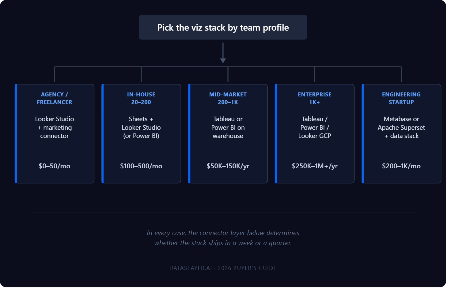
Agency or freelancer reporting on client paid media + GA4
Looker Studio (free) + a connector for non-Google sources is the dominant pattern. Total cost: $0 (Looker Studio) + $25-50/month per connector. Time to first dashboard: hours. Trade-off: performance degrades on large datasets, governance is limited. For most agencies under $5M revenue, this is the right answer.
In-house marketing team at a 20-200 person company
Google Sheets + connectors for ad-hoc analysis. Looker Studio for shared dashboards. Power BI if you're already a Microsoft shop. Total cost: $100-500/month all in. Trade-off: you'll outgrow this when data volume exceeds Sheets row limits or when stakeholders demand sub-second interactivity on large datasets.
Mid-market data team (200-1,000 people, dedicated analytics function)
Tableau or Power BI on top of a warehouse. The marketing data lands in BigQuery, Snowflake, or Redshift via a connector or ETL, then is modeled in dbt or LookML, then visualized. Total cost: $50K-150K/year for the stack. Trade-off: real engineering investment, but the ceiling is high.
Enterprise (1,000+ people, multiple business units)
Tableau, Power BI, or Looker (GCP) as the primary BI platform with embedded analytics where needed. Domo if you want a single all-in-one. Marketing data is one source of many feeding the platform. Total cost: $250K-1M+/year for the stack. Trade-off: significant procurement and integration effort, but the platform handles the full enterprise data estate.
Engineering-led startup with a modern data stack
Metabase or Apache Superset on top of a warehouse. Marketing data lands in the warehouse via a managed connector or open-source ETL. Total cost: $200-1,000/month including infrastructure. Trade-off: requires self-service comfort and warehouse fluency.
What the listicles usually get wrong
Most "best data visualization tools" lists rank by capability or popularity. That's not the right axis for a marketing team.
The actual blockers are: (1) does the tool connect to the data you need, (2) can your team learn it in days not months, (3) does the pricing make sense at your scale, (4) does it scale to your data volume. Chart aesthetics are usually a tie at the top of the market. Tableau, Power BI, Looker Studio Pro, and Sigma all produce credible charts. The differences that matter are upstream of the chart.
If your dashboard never ships because the data integration cost outpaces the tool budget, the prettiest charts in the world are worthless. Pick the integration layer first; pick the viz tool second; pick the chart style last.
FAQ
What is the best data visualization tool in 2026?
There is no single "best." The right tool depends on team size, technical maturity, data sources, and budget. For most marketing teams under 50 people, Google Sheets or Looker Studio plus a marketing data connector is the highest-leverage starting point. For larger teams with a dedicated analytics function, Tableau or Power BI on top of a warehouse becomes the standard.
Is Tableau better than Power BI?
Tableau has the edge in visual flexibility and analytical depth; Power BI has the edge in price and Microsoft ecosystem integration. Mac-based teams default to Tableau because Power BI desktop authoring is Windows-only. Microsoft-shop organizations almost always default to Power BI because of the Office 365 integration and pricing.
Is Looker Studio free? Is it being deprecated?
Looker Studio (the dashboarding tool, distinct from Looker the GCP enterprise platform) has a free tier that covers most agency and SMB use cases. Looker Studio Pro is $9/user/month for governance features. Google renamed Looker Studio to Data Studio in early 2026, but the free tier and pricing structure remain. The tool itself is actively developed.
What's the cheapest way to build a marketing dashboard?
Google Sheets with a marketing data connector (free Sheets, $25-50/month per connector). Looker Studio with native Google connectors (free) plus partner connectors for non-Google sources (~$10-20/user/month per connector). Total cost under $100/month for most agency use cases.
Do I need a data warehouse to use a BI tool?
It depends on the tool. Tools like Looker, Sigma, Mode, Metabase, and Hex query warehouses directly and need one. Tools like Tableau and Power BI work without a warehouse but get more powerful with one. Tools like Looker Studio, Domo, and Klipfolio can query data sources directly without a warehouse for many use cases.
Which data visualization tool has the most native marketing connectors?
Domo and Klipfolio are the strongest on native marketing connector breadth. Looker Studio has a large Partner Connector ecosystem (paid) for non-Google sources. Google Sheets and Excel, combined with marketing connector add-ons like Dataslayer, can match this for a fraction of the cost.
Conclusion
The data visualization tool you pick matters less than how the data gets into it. Most marketing teams pick a BI tool first, then discover three months later that connecting Meta Ads or LinkedIn Ads requires either custom ETL development or a separate $200/month subscription. Reverse the order: pick the integration story first, the viz layer second.
For agencies and small in-house teams: Google Sheets or Looker Studio with marketing connector add-ons covers 80% of needs at under $100/month. For mid-market teams: Tableau or Power BI on top of a warehouse, with marketing data piped in via a connector layer. For enterprise: Tableau, Power BI, or Looker GCP with the full warehouse + ETL stack underneath.
Whichever tool you pick, the connector layer underneath is what determines whether you ship dashboards in a week or a quarter. Dataslayer connects marketing data to all 18 of the tools above. Pick the viz tool that fits your team, and we handle the integration layer beneath it.


