

Why 70% of Dashboards Fail (And How to Design Yours Differently)
Most marketing dashboards are built backward. Teams spend weeks pulling together every possible metric, then wonder why no one uses the final product. The average person can only process 7 chunks of information at a time (Miller's Law), yet many dashboards cram 20+ widgets onto one screen. Meanwhile, businesses using data-driven strategies drive 5-8 times as much ROI compared to those making gut-feel decisions.
This guide covers 15 principles that transform cluttered data dumps into dashboards people actually use. Whether you're tracking PPC campaigns, monitoring social metrics, or consolidating metrics from multiple platforms, these principles will help you create reports that lead to faster decisions.
The Foundation: Understanding Before You Build
1. Define One Clear Purpose (Not Five)
Every dashboard that requires a 10-minute explanation has failed before anyone clicks a button.
The problem: You open a marketing dashboard and see website traffic next to email open rates next to inventory levels. Which question does this answer? None clearly.
The solution: Write a one-sentence purpose statement before touching any design tool. Examples:
- "Show which paid campaigns are closest to our $50 CPA target"
- "Track content performance by traffic source this month vs. last month"
- "Monitor real-time conversion rates to catch broken tracking"
Test your dashboard against the "five-second rule", can someone who just walked into the room answer your core question in five seconds? If not, you're showing too much.
2. Know Your Audience's Data Literacy
Your CMO needs different information than your PPC specialist.
Executive dashboards: 3-5 high-level KPIs with clear trends. "Revenue grew 23% this quarter" not "12,847 sessions with 2:43 average duration."
Analyst dashboards: Drill-downs, segment comparisons, granular filters. These users investigate, not just monitor.
Client dashboards: Balance transparency with clarity. Show progress toward goals with enough supporting detail to build confidence.
Visual Hierarchy: Making Important Things Look Important
3. Use the Z-Pattern or F-Pattern Layout
Eye-tracking studies confirm how people scan screens: most viewers follow a Z-pattern (top left → top right → bottom left → bottom right) or F-pattern (top left → down → right → down).
Place your most critical metric in the top-left corner. That's where eyes land first. Secondary KPIs go across the top row. Supporting details and contextual data fill the lower sections.
Bad example: Putting conversion rate in the bottom right while featuring vanity metrics like total impressions at the top.
Good example: Conversion rate front and center, with cost-per-conversion beside it, and impression data available lower or in a secondary view.
4. Create Visual Weight Through Size and Color
Not all numbers deserve equal attention.
Bold, large numbers signal importance. If your monthly revenue and website bounce rate have the same font size, you're sending the wrong message.
Use 3-4 sizes maximum:
- XL: Primary KPIs (Revenue, ROAS, Conversion Rate)
- Large: Secondary metrics (Traffic, Clicks, Cost)
- Medium: Supporting data (Session duration, Pages per session)
- Small: Labels and annotations
Color also creates hierarchy. Reserve your brightest, most saturated colors for critical data. Use grays and muted tones for context and labels.
5. Limit to 5-7 Main Elements
Your brain's working memory holds roughly 7 pieces of information simultaneously. Beyond that, cognitive overload kicks in.
Count the distinct "chunks" on your dashboard:
- Each chart = 1 chunk
- Each KPI card = 1 chunk
- Each data table = 1 chunk
If you're over 7, start cutting or create a second dashboard. Use progressive disclosure, show summary views that link to detailed breakdowns when users need to investigate further.

Color Theory: Making Data Readable, Not Just Pretty
6. Stick to a 5-6 Color Palette Maximum
Rainbow charts look like a toddler discovered highlighters. Don't do it.
Use color strategically:
- Brand color: Your company's primary metrics
- Green: Growth, success
- Red/Orange: Alerts, declining metrics
- Blue: Neutral data
- Gray: Baselines, benchmarks
Tools like Adobe Color help build accessible palettes. Test with Coblis to ensure red-green combinations work for the 8% of men with color vision deficiency.
7. Maintain 4.5:1 Contrast Ratio Minimum
This isn't aesthetics, it's accessibility and reducing eye strain during long analysis sessions.
Test your text-to-background combinations using contrast checking tools. The Web Content Accessibility Guidelines (WCAG) require:
- 4.5:1 for normal text
- 3:1 for large text (18pt or 14pt bold)
Light gray text on white backgrounds might look clean, but it fails accessibility standards and frustrates users trying to read numbers quickly.
8. Never Use Color Alone to Convey Meaning
Imagine you've built a traffic light system: green for on-target, orange for warning, red for danger. Works great, until someone with deuteranopia (red-green color blindness) can't tell orange from red.
Add redundant indicators:
- Icons (✓ for success, ⚠ for warning, ✗ for problems)
- Patterns or textures in chart fills
- Text labels stating "Above Target" or "Needs Attention"
- Different line styles (solid, dashed, dotted) in line charts
This isn't just accommodation, it improves clarity for everyone.
Chart Selection: Matching Visualizations to Your Data
9. Choose Chart Types Based on the Question
Using the wrong chart type kills comprehension. Line charts show trends over time. Bar charts compare categories. Scatter plots reveal relationships between two variables. Histograms display distributions.
Pie charts deserve special mention: They're notoriously hard to read with more than 3-4 slices. Human eyes struggle comparing angles and areas. Use a bar chart instead, faster to read, easier to compare.
10. Simplify Data Visualizations
Dashboard design expert Stephen Few found that 3D effects reduce comprehension speed by up to 30%. Those shadows, gradients, and beveled edges? They're actively hurting your dashboard.
Cut:
- Chart backgrounds and borders
- 3D effects completely
- Most gridlines (light gray at most)
- Legends when you can directly label data
Clean, flat designs with direct labeling beat decorative charts every time.
Mobile Optimization: Dashboards Beyond the Desktop
11. Design Mobile-First (Or Mobile-Aware)
58% of global website traffic comes from mobile devices. Marketers check campaign performance on phones constantly. A desktop-only dashboard won't get used.
Mobile strategies:
- Vertical stacking: Rearrange side-by-side elements into vertical stacks
- Touch-friendly targets: Minimum 44x44 pixel buttons
- Progressive disclosure: Show top 3-4 KPIs upfront, details via "View More"
- Simplified charts: Replace complex multi-line charts with summary tables or simpler visuals
Google Analytics handles this well, mobile app shows critical metrics upfront while keeping detailed segments accessible.
12. Test at Multiple Breakpoints
Don't just check "mobile vs. desktop." Test at 320px (small phones), 768px (tablets), 1024px (small laptops), and 1920px (large monitors). Your 4-column layout might work at 1920px but break at 1024px and become unusable at 768px.
Avoiding the Most Expensive Mistakes
13. Don't Clutter with Decorative Elements
The most common dashboard mistake according to a survey of design professionals: "too many different types of information on one visualization."
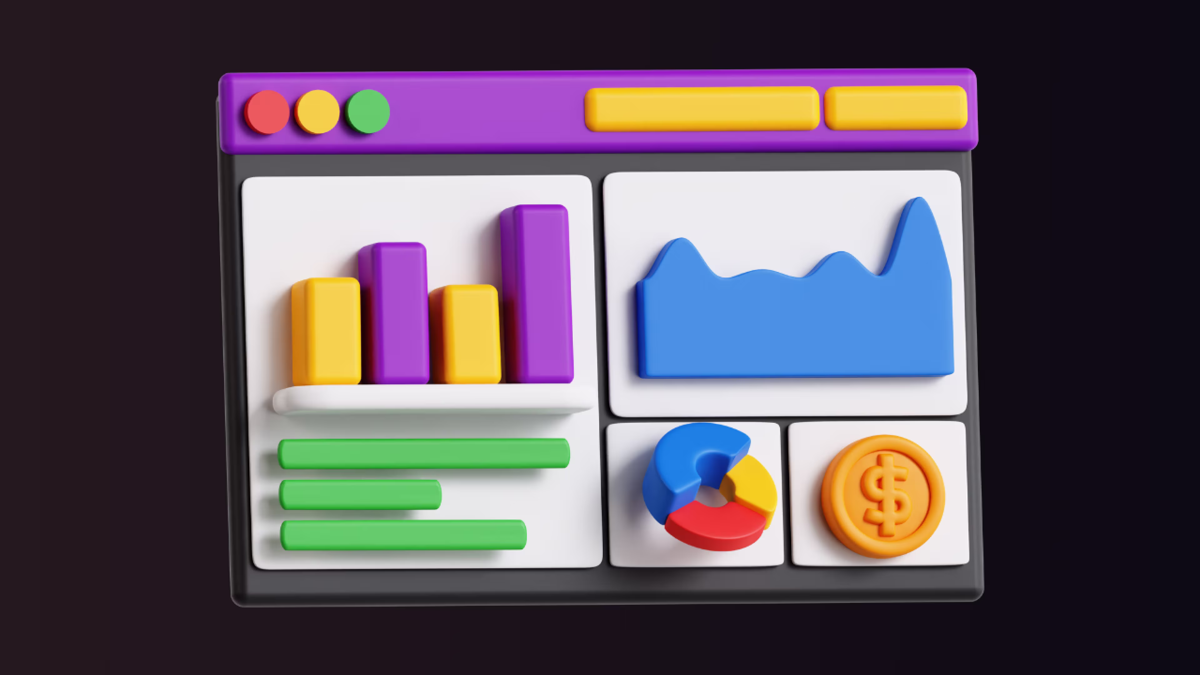
Those 3D pie charts shaped like donuts? The sparkly gradient backgrounds? The dashboard frames designed to look like car instrument panels? They're not helping. They're actively reducing comprehension.
Cut ruthlessly:
- Remove any element that doesn't represent data or help interpret it
- Delete logos from every widget (put it once in the header)
- Eliminate decorative icons that don't add meaning
- Strip out colored borders that aren't conveying information
- Remove clip art and stock photos
White space isn't wasted space, it's breathing room that helps users process information.
14. Provide Context for Every Metric
Showing "1,247 conversions" tells me nothing. Is that good? Bad? Normal?
Add meaningful context:
- Time comparisons: "Up 23% from last month"
- Goal progress: "83% of monthly target"
- Benchmarks: "15% above industry average"
- Sparklines: Mini trend charts showing the last 30 days
- Annotations: Mark campaign launches, holidays, or known anomalies
The Facebook Ads interface does this well, every metric shows period-over-period change with a clear up/down indicator and percentage.
15. Build Feedback Loops and Iterate
Your first dashboard version won't be perfect. That's fine.
Implement continuous improvement:
- Schedule 15-minute feedback sessions monthly with actual users
- Track which dashboard elements users interact with most (and least)
- Ask "What questions couldn't you answer?" after each presentation
- A/B test alternative layouts with small user groups
- Update dashboards quarterly as business priorities shift
The most successful dashboard teams treat design as an ongoing process, not a one-time project.
Putting It All Together
Great dashboard design isn't about cramming in every metric or making impressive screenshots. It's about answering specific questions quickly so marketing teams can make better decisions.
Start with one dashboard focused on one clear question. Apply these principles one at a time. Test with real users. Iterate based on feedback. (For more implementation strategies, check out our complete guide to marketing dashboard best practices.)
If you're consolidating data from multiple marketing platforms, Google Ads, Facebook Ads, LinkedIn, Google Analytics, tools like Dataslayer can automate the data pipeline to Google Sheets, Looker Studio, BigQuery, or Power BI, freeing you to focus on design rather than manual exports.
The goal isn't perfection. The goal is clarity that drives action.
Frequently Asked Questions
What's the ideal number of metrics on a marketing dashboard?
Stick to 5-7 primary metrics maximum. The human brain can process about 7 chunks of information before cognitive overload kicks in. If you need more metrics, create separate dashboards for different purposes (executive overview, campaign performance, content analytics) rather than cramming everything into one view.
How often should dashboards update?
Match update frequency to decision frequency. Real-time for paid ads where you need to catch broken campaigns immediately. Daily for most operational decisions. Weekly or monthly for strategic planning. If stakeholders only review performance monthly, real-time updates just create noise.
What are the biggest dashboard design mistakes?
Three killers: information overload (showing everything at once), wrong chart types (pie charts for time-series data), and lacking context (numbers without comparisons or trends). Also common: poor color choices that fail accessibility, designs that break on mobile, and prioritizing looks over clarity.
Do I need separate mobile dashboards?
No, but you need responsive design. Show your 3-4 most critical metrics immediately on mobile. Use vertical stacking instead of side-by-side layouts. Make touch targets minimum 44x44 pixels. Test at multiple screen sizes (320px, 768px, 1024px, 1920px). A good responsive dashboard adapts gracefully, not just shrinks awkwardly.
Should I use visualization tools or build custom dashboards?
Tools like Looker Studio, Tableau, and Power BI offer templates and built-in best practices, ideal for most marketing teams. They handle responsive design automatically and integrate with common data sources. Build custom only when you need highly specific functionality. For most marketers, using established tools plus automated data integration (through platforms like Dataslayer) delivers results faster than custom development.


