

Most marketing dashboards in 2026 track 30-50 metrics. Most marketing decisions get made by looking at three. The gap between what dashboards display and what teams actually use to decide things is the dirty secret of marketing reporting. The result is a slow accumulation of vanity metrics, conflicting numbers, and quarterly review meetings where the team agrees the dashboard is impressive without anyone being able to point at the metric that drove last quarter's budget shift.
This post is the playbook that fixes the gap. The principle is simple: every KPI on a marketing dashboard must answer a specific decision. If it does not, it is decoration, not data. From that principle, we derive a three-tier hierarchy (strategic, channel, operational), a list of anti-patterns to remove, and a layout that mirrors how decisions actually flow through a marketing org. By the end of this post, you should be able to audit your current dashboard and cut at least 30% of what is on it without losing any decision-making power.
The principle: every KPI must answer a decision
The fastest way to evaluate a metric is to ask three questions of it. If any answer is "no" or "not really," that metric does not belong on the dashboard you are looking at.
Question 1: What decision does this metric inform? Not "what does it tell us about the business" but specifically: what action would change based on this number going up or down? "Sessions are up 15%" only matters if there is a downstream decision tied to sessions. If the team would not act differently whether sessions are up 15% or down 15%, sessions is a status update, not a KPI.
Question 2: Who makes that decision, and how often? A metric that informs a quarterly board decision belongs on a strategic dashboard reviewed quarterly. The same metric on a daily campaign dashboard adds noise without adding decision velocity. Match the metric's reporting cadence to its decision cadence.
Question 3: What is the action threshold? "If conversion rate drops below 2%, we pause the campaign and audit the landing page." If you cannot articulate a threshold and an action, the metric is observation, not a KPI. Observations belong in exploratory analysis, not on the dashboard your team checks every Monday.
These three questions cut most dashboards in half on first pass. The metrics that survive are the KPIs. The metrics that fail belong somewhere else, or nowhere.
The three-tier KPI hierarchy
Marketing decisions happen at three levels in most organizations: strategic (board, CMO, founder), channel (paid media lead, SEO lead, content lead), and operational (campaign manager, content editor, analyst). Each tier has its own decision velocity, its own audience, and its own KPIs. Mixing them on one dashboard is the most common reason dashboards become unreadable.
Tier 1: Strategic KPIs (board and executive layer)
Decision velocity: monthly to quarterly.
Audience: CMO, CEO, founder, board.
Question they answer: Are we growing the right things at a sustainable cost?
The strategic tier deals with company-level outcomes, not channel-level mechanics. The board does not need to see Meta CTR; the board needs to see whether the marketing engine is producing pipeline at a CAC that matches the business model.
The five strategic KPIs that work for most B2B SaaS and many B2C subscription businesses:
- Pipeline generated by marketing-attributed sources. Measured monthly. The board cares about the trend and the share of total pipeline coming from marketing vs sales-led. The attribution debate matters here, which is why the marketing attribution framework post exists; strategic pipeline numbers should be triangulated, not pulled from a single platform's report.
- Customer acquisition cost (CAC), payback period, and LTV:CAC ratio. Three metrics that together tell you whether marketing spend is producing the right kind of revenue. A 3:1 LTV:CAC with a 12-month payback means a healthy machine; a 6:1 with a 24-month payback means you are leaving growth on the table.
- Revenue from marketing-sourced cohorts. Trail by 60-90 days for B2B sales cycles. Cohort the customers acquired in a given month back to their first marketing touch and measure their revenue at 6 and 12 months out.
- Brand search volume and direct traffic share. Proxies for brand strength. If brand search is declining over a 6-month rolling window, no amount of paid media performance will fix the underlying brand health issue.
- Channel mix versus benchmark. What percentage of acquisition comes from each major channel, compared to industry benchmarks for similar-stage companies. Heavy concentration on one channel is a strategic risk regardless of that channel's tactical performance.
Anything more granular than these five does not belong on the strategic dashboard. CTR, impressions, and view-through rates are channel concerns, not board concerns.
Tier 2: Channel KPIs (paid media, SEO, content leads)
Decision velocity: weekly to monthly.
Audience: channel leads, agency account managers, growth managers.
Question they answer: Where should the next budget dollar go within and across channels?
The channel tier is where most attribution and incrementality work pays off. The questions are concrete: should we scale Google Search by 30% next month? Pause the LinkedIn lookalike campaign? Reallocate from display to search?
Channel KPIs by major channel:
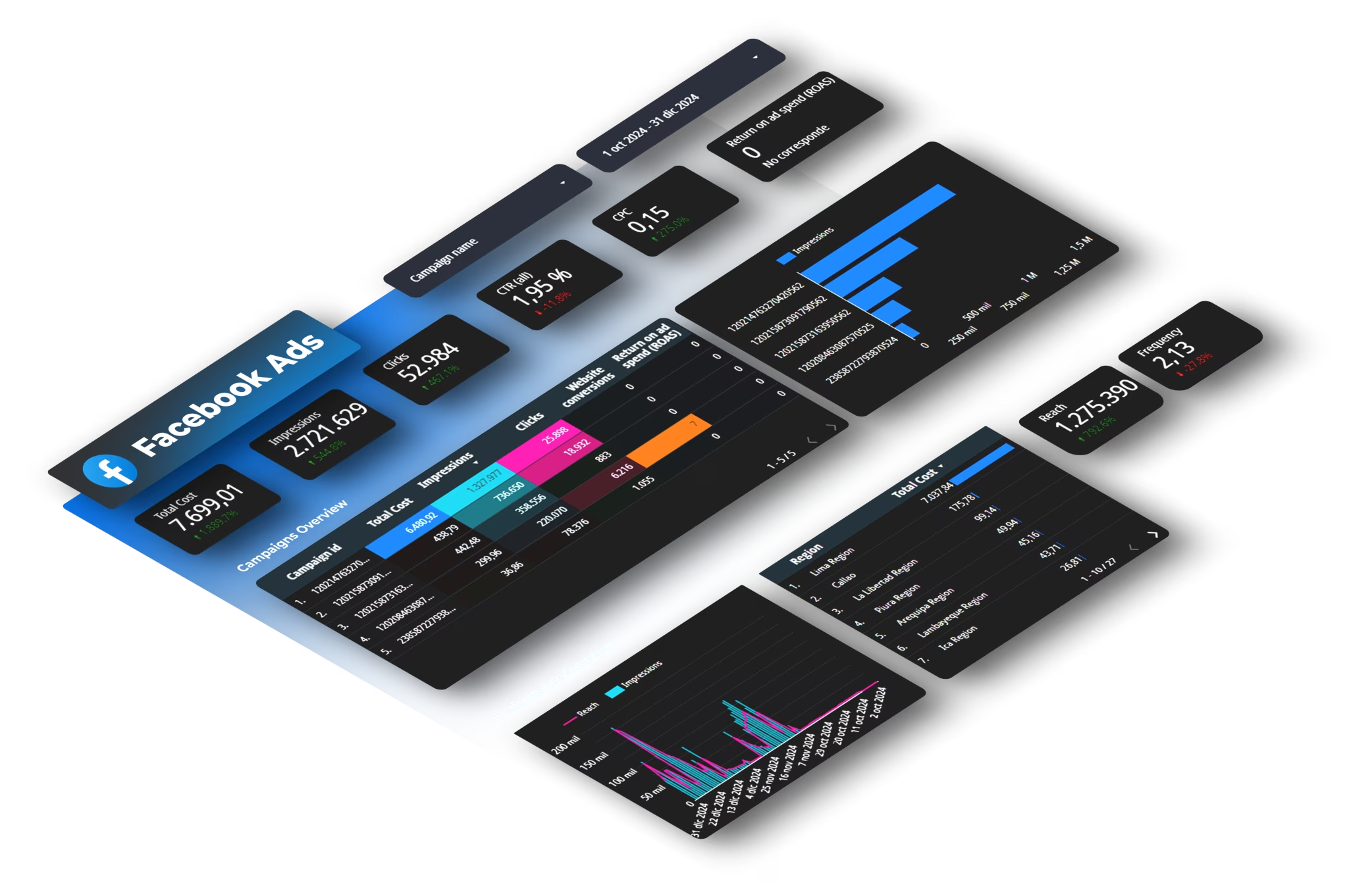
- Paid search and paid social: spend, impressions, clicks, CTR, CPC, conversions, conversion rate, CPA, ROAS, frequency. We covered the platform-specific reporting setup in our LinkedIn Ads to Google Sheets guide and Meta Ads to Google Sheets guide.
- Organic search: impressions, clicks, average position, CTR by query category, top landing pages by conversion. The Search Console to Google Sheets guide covers the data extraction.
- Content marketing: sessions per post, engagement rate, conversion rate per post, top posts by signup contribution, content-to-customer journey time.
- Email and lifecycle: open rate (caveated post-Apple Mail Privacy Protection, which inflates open rates for Apple Mail users since 2021), click rate, conversion rate, unsubscribe rate, list growth rate.
- Cross-channel synthesis: combined CAC, paid versus organic share of conversions, channel-by-channel CAC trend.
The mistake most dashboards make at this tier: showing all metrics at full granularity all the time. The fix: show summary by channel as the default view, with drill-down available on click. The dashboard becomes scannable in 60 seconds; the analysis lives one click deeper.
Build the dashboard layer faster
Dataslayer pulls the data behind every KPI in this playbook from Google Ads, Meta, LinkedIn, TikTok, Search Console, GA4, and 50+ platforms into Google Sheets, Looker Studio (now Data Studio), BigQuery, and Power BI. One source of structured data, every KPI ready to display.
Try Dataslayer FreeTier 3: Operational KPIs (campaign manager, analyst, content editor)
Decision velocity: daily to weekly.
Audience: campaign managers, content editors, paid media buyers, RevOps analysts.
Question they answer: What is working at the individual campaign, ad, or content piece level, and what needs intervention this week?
The operational tier is where things get tactical. Specific campaign IDs, specific ads, specific landing pages, specific keywords. The metrics are familiar: CTR, conversion rate, quality score, ad relevance, frequency, video completion rate, time on page.
The principle that separates good operational dashboards from bad ones: every operational KPI must have a clear "intervention threshold" attached. CTR below 1% triggers ad creative review. Frequency above 4 triggers audience expansion. Quality score below 5 triggers landing page audit. Without thresholds, operational metrics become daily anxiety drivers without driving daily action.
A practical operational dashboard has 8-12 KPIs maximum, each with its threshold annotated directly in the dashboard. The operational team owns the response to each threshold; the channel lead reviews exceptions weekly.
Anti-patterns: KPIs to remove from your dashboard right now
After 18 months of working with marketing teams to clean up their dashboards, the same 6 metrics keep appearing without driving any decision. If your dashboard contains these, audit them against the three questions and consider deleting.
Total website sessions as a top-line metric. Sessions are correlated with revenue but rarely cause it. Without segmentation by channel and intent, total sessions is a vanity number. Replace with "organic sessions to comparison and bottom-funnel pages" or "paid sessions to landing pages with active campaigns." Same data source, much higher decision relevance.
Bounce rate. Bounce rate has been mostly meaningless since 2019, when GA4 deprecated it as a default metric in favor of engagement rate. Google's official GA4 documentation on engagement vs bounce explains the rationale. The remaining use cases for bounce rate are very narrow (single-page comparison sites mostly). If bounce rate is on your dashboard, the team is looking at a metric that does not reflect how users actually behave on modern sites.
Social media follower count. Follower count grows with passive activity (someone following you for one post and never engaging). Engaged followers and conversion-correlated followers matter; total follower count rarely does. The exception is for organizations whose business model depends on audience scale (publishers, creator-economy companies); for everyone else, replace with "engaged followers" or "conversion attributable to social."
Average time on page. Heavily distorted by users who open a tab and leave it for 6 hours. Without dwell-time bucketing (under 10 seconds, 10-30 seconds, 30-120 seconds, 2 minutes plus), the average is meaningless. If you do bucket properly, the metric becomes useful but is rarely what is reported on dashboards.
View-through conversions reported by walled gardens, treated as truth. Meta, Google, and other platforms report view-through conversions as if they are deterministic. They are mostly modeled. Reporting these alongside click-through conversions without distinguishing them inflates dashboard numbers. We covered this dynamic specifically for one platform in our Meta first-conversion versus all-conversions analysis; the pattern repeats across walled gardens.
Net promoter score (NPS) on a marketing dashboard. NPS is a customer success metric, not a marketing dashboard metric. Putting it on the marketing dashboard creates the impression that marketing owns NPS, which it usually does not. Move NPS to the customer success dashboard where the team that actually moves it can see and act on it.
If your dashboard contains four or more of these, your dashboard is a status display, not a decision tool. Cutting them frees up real estate for KPIs that drive decisions.
Building the dashboard: layout principles that mirror decisions
A KPI list is the start, not the dashboard. The layout determines whether the team actually reads it. After hundreds of dashboards reviewed, three layout principles consistently separate the dashboards teams use from the ones they ignore.
Top of dashboard: the question the dashboard answers. Not the title "Q3 Marketing Performance" but the specific question, like "Are we generating pipeline at the right cost in Q3?" The question forces the dashboard to be focused. Many dashboards have no question, which is why they accumulate metrics.
KPI cards above charts. A KPI card shows the current value, the comparison to a benchmark or previous period, and the threshold/target. Cards are scannable in seconds. Charts are deeper. Putting cards above charts respects the reader's time: they get the headline in the first 10 seconds, the detail when they want it.
Decision-driving comparisons over absolute numbers. "$45,000 spent" is less useful than "$45,000 spent, which is +12% versus last month and -8% versus target." The comparison is what triggers a decision. Always show the absolute number AND its comparison.
Filtering at the top, not embedded. If the dashboard supports multiple time periods, channels, or campaigns, the filter controls go at the top of the page where users expect them. Embedded filters scattered across charts are a usability anti-pattern.
For more on layout principles, our dashboard design best practices guide goes deeper into the visual hierarchy and information density side of the problem; this post focuses on the strategic question of which KPIs deserve placement at all.
Implementation: from KPI list to live dashboard in 30 days
The playbook is conceptually clean. Here is what a marketing or RevOps team can ship in 30 days.
Week 1: Audit and cut. Take your current dashboard and apply the three questions to every metric. Move metrics that fail the audit to a "consideration" list (you might restore some later). The first cut typically removes 30-50% of the metrics on the dashboard.
Week 2: Define the three tiers. Decide which surviving metrics belong at the strategic, channel, and operational tier. Most teams discover that their old dashboard mixed all three, which is why no one read it carefully.
Week 3: Build the data layer. Pull data from every platform into a single warehouse or sheet. Validate that the numbers reconcile against platform UIs. Document attribution and modeling assumptions so the team knows what each metric means. Our multi-channel attribution dashboard guide walks through the technical layer for unifying multiple platforms.
Week 4: Build the dashboards. Three dashboards, one per tier. Cards above charts. Filters at the top. The strategic dashboard fits on one screen. The channel dashboard fits on one screen per channel. The operational dashboard can be deeper but must have intervention thresholds annotated.
After 30 days, the team has a working KPI playbook with implementations. The next quarter is iteration: which metrics are actually being used in decisions, which are being ignored, and what to add or remove based on the patterns.
What changes for KPIs in the post-attribution era
Two recent developments shift the playbook slightly from how it would have looked even two years ago. Both are important to bake into the 2026 version.
Attribution-based KPIs need triangulation, not single-source. The old model of "platform-reported conversions = truth" no longer holds in 2026. Strategic and channel KPIs that depend on attribution should be calculated from multiple sources (platform reports + GA4 + CRM + incrementality results) and either reported as a range or shown side-by-side. The strategic KPI "CAC by channel" becomes "CAC by channel per source, with our incrementality multiplier applied." This is more work but produces decisions you can defend.
AI search and zero-click change the value of organic KPIs. Traditional organic KPIs (impressions, clicks, position) understate organic value when AI Overviews answer questions on the SERP. The fix is to add new KPIs that account for AI-driven traffic and brand mentions in AI responses. We covered the AI Overviews dynamic specifically in our AI Overviews CTR analysis.
These shifts do not invalidate the playbook; they refine it. The three-tier hierarchy and the decision-driven principle stay; the specific KPIs at each tier evolve with the measurement environment.
FAQ
How many KPIs should a marketing dashboard have?
For most teams: 5 strategic KPIs, 8-12 per major channel at the channel tier, 8-12 operational KPIs per campaign manager. The total across all three dashboards typically lands at 30-50 metrics. The mistake is cramming all of them on one dashboard; spread across three tiered dashboards, each is scannable in 60 seconds.
Should I include the same KPI on multiple tiers if it matters at all levels?
Yes, but only if the cadence and decision differs. CAC on the strategic dashboard is monthly, viewed by the CMO, and triggers strategic decisions. CAC on the channel dashboard is weekly, viewed by the paid media lead, and triggers budget reallocation. Same metric name, different cadences, different thresholds, different actions.
How do I get the team to actually use the new dashboard?
Three patterns work. First, attach the dashboard to a recurring meeting (weekly channel review, monthly strategic review). Second, write down the actions taken in the meeting and reference back to which dashboard cell drove them. Third, audit the dashboard quarterly and cut metrics that have not driven any documented decision in the last quarter. Dashboards that are evergreen referenced get evergreen used.
What about real-time dashboards?
Real-time dashboards are mostly noise for marketing decisions. Real-time matters for incident response (server down, ad disapproval, broken landing page) where the operational team needs to react in minutes. For everything else, daily or weekly cadence is enough; real-time creates anxiety without improving decisions.
Should I report on competitors in my marketing dashboard?
Add competitive context to the strategic tier (share of voice, brand search volume comparison) but do not add competitor performance metrics that you cannot influence. Reporting on a competitor's CTR or estimated spend produces commentary, not decisions.
How does this playbook apply if my company is pre-product-market-fit?
The same three tiers, fewer metrics. Pre-PMF, the strategic tier might have just two KPIs (qualified pipeline, customer feedback signal); the channel tier might consolidate to "where do leads come from"; the operational tier exists only for the channels you actively run. Cut harder than the playbook suggests; you have less infrastructure to maintain.
How does the Looker Studio rebrand to Data Studio affect this playbook?
It does not. The rebrand was a naming change, not a product change. The playbook applies identically whether you build dashboards in Data Studio (formerly Looker Studio), Power BI, Tableau, or a custom solution. We covered the rebrand specifics in our Looker Studio to Data Studio rebrand post.
Conclusion
The reason most marketing dashboards do not drive decisions is structural, not visual. Adding more colors or charts does not fix a dashboard that mixes strategic, channel, and operational metrics on one screen, treats every metric as equally important, and lacks decision thresholds. The fix is the three-tier approach: separate the dashboards by decision velocity and audience, apply the three-question test to every metric, remove the six anti-patterns, and lay out the dashboards so the question they answer is visible at the top.
Most teams cut 30-50% of their dashboard metrics on first audit and notice no loss in decision-making power. The remaining metrics get more attention, more discussion, and drive more decisions because they are not buried in noise.
If you want to skip the data plumbing and get to the dashboard layer quickly, start a free Dataslayer trial. The KPI playbook is what your team builds; Dataslayer pulls the data the playbook needs from every platform you run, into the tool you build dashboards in.


