TL;DR: Add the Dataslayer Google Ads Community Connector inside Looker Studio in under 10 minutes (three entry points below), then build three Google-Ads-specific dashboards the native Google connector handles poorly: Performance Max asset-group performance (still opaque even after the 2025 asset-level rollout), search terms and negative keyword opportunities (increasingly filtered by privacy thresholds), and campaign-type separation so PMax, Search, Shopping, Display, and Video stop blending into a single account average.
Three reporting realities make Google Ads harder to visualize than it should be in 2026. The first is Performance Max: Google added asset-group and asset-level fields to the Google Ads API in 2024-2025, but pulling them cleanly into Looker Studio alongside a Search vs PMax split still depends on which connector you use and how its schema is configured. The second is the search terms report, where privacy-driven query filtering has been getting more aggressive; a growing share of spend now hides behind "(other)" buckets. The third is Google's 37-month data retention cap enforced from June 1, 2026, which quietly cuts off long-window historical dashboards without warning.
How to connect Google Ads to Looker Studio with Dataslayer
Dataslayer is a Looker Studio Community Connector, so the entire connection happens inside Looker Studio itself. There are two entry points; pick whichever fits your workflow. Total time from logged-in user to a live data source: under 10 minutes.
Entry point 1: from the Dataslayer dashboard. Log in at app.dataslayer.ai with your Google account. Open the Destinations section and click Open Looker Studio. A new Looker Studio document opens with the full list of Dataslayer connectors visible; pick Google Ads.
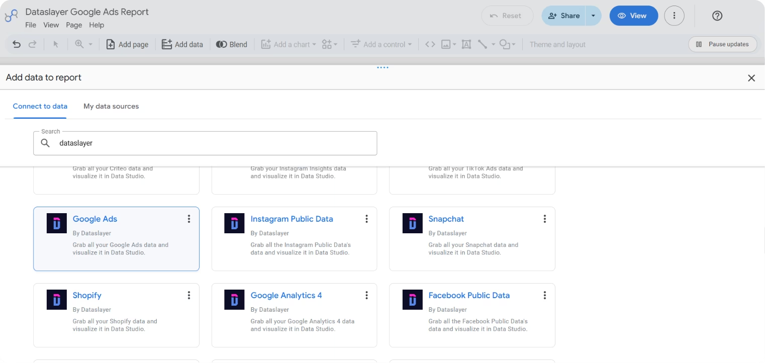
Entry point 2: from inside any Looker Studio dashboard. Click Add data to report, type "Dataslayer" in the connector gallery search, and select the Google Ads connector from the results.
Whichever entry point you use, the next steps inside the Looker Studio connector configuration are the same:
Authorize Google. The connector configuration screen prompts for OAuth authorization. Sign in with the Google account that has at least Read access to the Google Ads account you want to report on, and grant the requested read permissions.
Select ad accounts (single or MCC). Choose one or many Google Ads accounts to include in this data source. Manager (MCC) accounts expand to show all child accounts you can pull from in the same query.
Set optional parameters (or leave defaults). The connector exposes options like attribution model, conversion window, currency handling, and campaign-status filters. Defaults work for most reporting use cases; tighten them only if you have a specific reason (attribution model is the one that most commonly needs an explicit choice, see the Setup Details section below).
Click Connect. Looker Studio loads the full Google Ads schema and adds the data source to your report. From there it works like any Looker Studio data source: drag fields onto charts (spend, impressions, conversions, ROAS, search impression share, quality score, plus PMax asset-group fields), set filters at page level, and share with stakeholders.
You need to be logged into dataslayer.ai for the connector to work. If you have no paid plan, a 15-day free trial activates automatically; after the trial, the account drops to the free tier (no payment details required at any point).
Native Google connector vs Dataslayer: what changes
Google publishes its own first-party Looker Studio connector for Google Ads, which is fine for single-account overview dashboards. Once the report needs multi-account MCC pulls, PMax asset-group depth, cross-source blending, or the full Search Impression Share family, the differences below become the reason to switch to a community connector.
Capability
Native Google Ads connector
Dataslayer Google Ads connector
Multi-account (MCC) in one data source
One account per data source
Multiple accounts, including MCC children, in one data source
PMax asset-group depth
Limited to campaign-level PMax metrics
Asset Group ID, Name, and Status dimensions exposed
Search Impression Share family
Basic Search IS metric
Full family: Search IS, lost-to-budget, lost-to-rank, top and absolute top variants
Cross-source blending
Requires a separate connector per platform
Same connector pattern across Meta, TikTok, LinkedIn, GA4, and 50+ sources
Currency handling
Account native currency only
Native plus currency-normalized fields (EUR, USD, GBP, AUD, SEK, SAR)
For teams already invested in warehouse-first workflows, piping Google Ads into BigQuery and then to Looker Studio remains viable but adds storage costs, engineering time, and refresh lag most marketing teams don't need. If you also need the same Google Ads data in a spreadsheet, see the companion guide on connecting Google Ads to Google Sheets.
Performance Max asset-group performance: the black box you can partially open
Performance Max grew into a substantial share of Google Ads spend in 2025-2026, and the native Google Ads UI still reports it as a mostly opaque single-line item. Google added asset-group and asset-level reporting to the Google Ads API in 2024-2025 releases, but pulling those fields into a Looker Studio dashboard depends on the connector's schema, and Dataslayer exposes the Asset Group ID, Name, and Status dimensions directly alongside the standard metric set. This is the dashboard that separates account managers from Google's default reports.
The dashboard to build: a PMax asset-group deep dive.
Asset-group spend vs conversion share. A stacked bar chart showing each asset group's percentage of PMax spend against its percentage of PMax conversions. When an asset group's spend share exceeds its conversion share by more than 5 percentage points, it's a candidate for pause or reallocation. This is the same wedge-vs-share logic behind the Meta Advantage+ analysis, applied to PMax.
Asset-group CPA vs PMax campaign average. A horizontal bar chart showing each asset group's CPA as a percentage above or below the PMax campaign average. Groups that consistently sit 30%+ above average without a compensating value-per-conversion story deserve creative or signal-source review.
Channel breakdown within PMax. A pie or donut showing where PMax actually served (Search, Display, YouTube, Discover, Gmail, Shopping). Google no longer forbids this breakdown in the UI as of 2024, but the split still hides in the Insights tab. Surfacing it in the main dashboard changes the conversation from "PMax is doing well" to "PMax is doing well because 60% of its budget is winning branded Search auctions."
Signal-source performance (audience signals + search themes). A table showing which audience signals and search themes actually drove conversions vs which were declared but underused. Signals that never fired productively are a hint to remove them so PMax reallocates budget.
Looker Studio Template
Google Ads Overview
Full performance overview by campaign, ad group, and keyword. Ready to copy into your own Google account and connect via the Dataslayer Google Ads connector for a live PMax asset-group deep dive.
Search terms and negative keyword opportunities: what the filters hide
Google's search terms report was already truncated by privacy thresholds; the share of Search spend hidden under "(other)" has kept creeping up through 2024-2026. The terms that do appear are more valuable than ever because they are the visible portion of what your keywords actually matched. The native Google Ads connector for Looker Studio exposes search terms, but doesn't structure the view around the negative-keyword decisions that actually save money.
The dashboard to build: a search-terms operating view.
High-spend, zero-conversion terms. A sorted table of search terms with spend above a threshold you set and zero recorded conversions in the reporting window. These are the negative-keyword candidates that pay for themselves the first week after being added. Add a column for match type so the review reads faster.
Terms not in the keyword list, ranked by conversions. A filtered table showing search terms that produced conversions but do not appear as exact-match keywords in the account. These are the promotion candidates for the exact-match column. Every account has some; without a dashboard, they never get promoted because nobody has time to eyeball 4,000 rows of the search terms report.
Match-type mix by spend and by conversions. A stacked bar showing what share of Search spend and Search conversions is coming from exact vs phrase vs broad. Broad match has become materially different in 2024-2026 (Google now leans on it heavily for PMax-like account signal), so the mix is a diagnostic worth checking monthly.
"(other)" and hidden-query share. A small scorecard showing what percentage of Search spend fell into the privacy-filtered "(other)" bucket. When this number crosses 30-40% (thresholds vary by account size), it is a signal that the visible search terms report is representative of a shrinking share of actual queries, and that broad-match and PMax attribution assumptions need to be revisited.
Campaign type separation: PMax, Search, Shopping, Display, Video on their own lines
The single most important account-level view Google's own reporting does poorly: a proper split of the account by campaign type. Account averages blend PMax, Search, Shopping, Display, and Video into a single number that describes none of them accurately, because their CPAs, conversion behaviors, and roles in the funnel are structurally different. The Dataslayer Google Ads connector exposes the Advertising Channel Type and Advertising Channel Sub-Type dimensions that make this split trivial in Looker Studio, but leaves the dashboard layout to you.
The dashboard to build: a campaign-type segmented view.
Spend, conversions, ROAS by campaign type. Five columns of scorecards (Search, Performance Max, Shopping, Display, Video), each with the same three metrics. Lets stakeholders see at a glance which types are pulling their weight relative to their share of spend, without doing arithmetic in their head.
Trend lines split by campaign type. Two stacked time-series: spend over time by campaign type, and ROAS over time by campaign type. Reveals whether the account is drifting into PMax dependency and whether ROAS is converging or diverging across types over the last 90 days. Layer Google Ads multi-campaign experiments on top when a divergence needs a controlled test rather than a hypothesis.
PMax vs Search brand overlap. A small section flagging brand-keyword impressions attributed to PMax. PMax has a well-documented tendency to absorb branded Search traffic that Search campaigns would have won anyway, inflating PMax's apparent ROAS at Search's expense. A brand-keyword negative on PMax is a standard defensive move worth surfacing in the dashboard.
Search Impression Share and Search Lost IS (rank / budget) by campaign type. Two horizontal bars per campaign type showing impression share won vs lost, split into "lost to rank" and "lost to budget." This is where account-level opportunity actually sits: campaigns lost to budget with strong ROAS are the highest-return incremental spend, and the dashboard makes that visible instead of buried in a per-campaign drill-down.
The reason this dashboard matters: optimization decisions made on blended account-level numbers tend to be wrong in both directions (cutting a PMax that is actually generating incremental sales because its blended CPA looks bad, or scaling a Search campaign that has already saturated its keyword universe). Splitting by type is the minimum viable interpretability for a modern Google Ads account.
Looker Studio Template
Google Ads Campaigns, Ad Groups & Keywords Overview
Splits performance by campaign level so the account average stops hiding what each type is actually doing. Copy the template and connect it to your own Google Ads account to see the campaign-type separation dashboard live.
Dataslayer connects Google Ads to Looker Studio with unlimited rows on paid plans, MCC support in a single query, full PMax asset-group schema, and Looker Studio's native scheduled refresh. Same connector pattern across Meta, TikTok, LinkedIn, GA4, Klaviyo, Shopify, and 50+ other sources.
Six implementation choices that affect Google Ads data reporting more than they affect other connectors. Get them right at setup; don't discover them later.
Attribution model: pick once, enforce everywhere. Google Ads defaults to data-driven attribution for most accounts in 2026 (last-click is still available as an alternative). Make sure the connector uses the same attribution model as the Google Ads UI view you're benchmarking against. Mixing data-driven and last-click in the same dashboard is the most common source of "the numbers don't match" tickets from clients.
MCC hierarchy and cross-account currency. When pulling from a Manager (MCC) account with child accounts in multiple currencies, decide upfront whether to report in each account's native currency or normalize to a single reporting currency. Dataslayer exposes both native Cost and currency-normalized fields (Cost EUR, USD, GBP, AUD, SEK, SAR); mixing currencies in one dashboard without picking a lane is misleading.
PMax asset-group and asset-level fields. If the dashboard needs PMax deep-dive functionality (dashboard #1 above), verify the connector schema includes the Asset Group ID, Asset Group Name, and Asset Group Status dimensions along with standard performance metrics. Dataslayer exposes these fields directly in the Google Ads connector; older or slimmer connectors may not, which produces an incomplete PMax view.
Historical data 37-month cap. Google enforced a 37-month cap on granular Google Ads reporting from June 1, 2026 (see the 37-month cap explainer). Reports that pull from windows longer than 37 months will show truncated data for older periods. If long-window YoY reporting is a requirement, mirror the data into a warehouse (BigQuery, Snowflake) on an ongoing basis so future queries can extend past the API's own retention. Note that Google's own BigQuery Data Transfer connector deprecated three column names in March 2026 (see the BigQuery connector deprecation summary); Dataslayer's BigQuery destination keeps a stable schema across those changes.
Google Ads vs GA4 conversion discrepancy. Google Ads and GA4 report conversions differently (event-based vs conversion-action-based, cross-device vs single-device, model differences). Do not try to reconcile them column by column inside the same dashboard without acknowledging the definitional gap. See the 8 reasons Google Ads and GA4 disagree for the checklist of what to explain to stakeholders before they ask.
FAQ
Does Google publish its own Looker Studio connector for Google Ads? Yes. Google Ads has an official first-party Looker Studio connector, which is fine for single-account overview dashboards. It has real limits for multi-account MCC reporting, PMax asset-group depth, and cross-source blending, which is where community connectors like Dataslayer add value.
Can I pull data from multiple Google Ads accounts (MCC) in a single Looker Studio data source? Yes with Dataslayer, one data source can pull from multiple child accounts under an MCC. The native Google connector historically requires one data source per account, which multiplies both setup work and per-account authorizations.
How do I see Performance Max asset-group performance in Looker Studio? Pull the Asset Group ID, Name, and Status dimensions alongside standard performance metrics, filter to Performance Max campaigns, and group by asset group. Dataslayer's Google Ads connector exposes these fields directly.
Can I combine Google Ads with Meta, TikTok, LinkedIn, and GA4 in one Looker Studio dashboard? Yes. Looker Studio blended data sources join on common dimensions (date is the most common join key). Dataslayer uses the same connector pattern across Meta, TikTok, LinkedIn, Amazon Ads, Klaviyo, GA4, Shopify, and 50+ other sources, so all paid channels sit side by side with consistent field naming.
Does Dataslayer charge per user or per data source? No per-user fee. User seats scale with the plan: Starter includes 1 user, Advanced includes 10 users, Pro includes unlimited users. Each destination (Looker Studio, Google Sheets, BigQuery, etc.) is a separate subscription rather than a per-seat fee, with bundle discounts of 10% for two destinations and 15% for three or more. See the pricing page for the current 2026 plan structure.
Conclusion
The three dashboards above (Performance Max asset-group deep dive, search terms and negative keyword opportunities, campaign-type separation) cover the reporting questions that the native Google Ads UI and native Looker Studio connector handle poorly in 2026. They are the dashboards an account manager wishes existed by default but has to build.
With Dataslayer's Google Ads connector, the data path takes under 10 minutes. The rest is Looker Studio layout work, which compounds: once the PMax, search terms, and campaign-type dashboards exist, adding Meta Ads, TikTok, LinkedIn, GA4, or Stripe to the same view is another connection using the same filters and refresh cadence. For which Google Ads metrics belong in the reporting stack in the first place, the 15 essential Google Ads metrics guide is the recommended companion read, and the PPC Reporting guide covers the wider cross-channel setup this tutorial fits into.
Start a free Dataslayer trial to connect Google Ads to Looker Studio in under 10 minutes (no credit card required), with unlimited rows on Looker Studio across all paid plans and access to 50+ other marketing data sources for when your reporting needs to span more than Google alone.